¶ Pulse Asset Performance
The Pulse Asset Performance Dashboard allows users to monitor their industrial equipment in real time. It displays key performance metrics such as boiler efficiency, plant heat rate, and turbine heat rate, allowing for easy trend analysis, performance comparison against design values, and identification of efficiency-related issues.
This page specifically displays efficiency calculations for the power plant. A higher boiler efficiency is better, while a lower turbine heat rate is better. Users can view data for all the units assigned to them in one place, making it simple to monitor and take necessary actions.
¶ User Interface Elements
¶ 1. Search Bar
- Located at the top left of the screen.
- Allows users to search for specific units, parameters, or systems.

Figure 1. Search Bar
¶ 2. Date Range Selector
- Positioned at the top right of the screen.
- Enables users to filter performance data for specific date ranges.
- Two date filters are visible: 2025-03-22 ~ 2025-03-23 and 2025-03-23 ~ 2025-03-24. The reason for the input of two date ranges is to compare the data values for the two date ranges for better analysis. This is explained in detail later in this document.
Figure 2 Date Range Selector
¶ 3. Unit & Systems List (Left Panel)
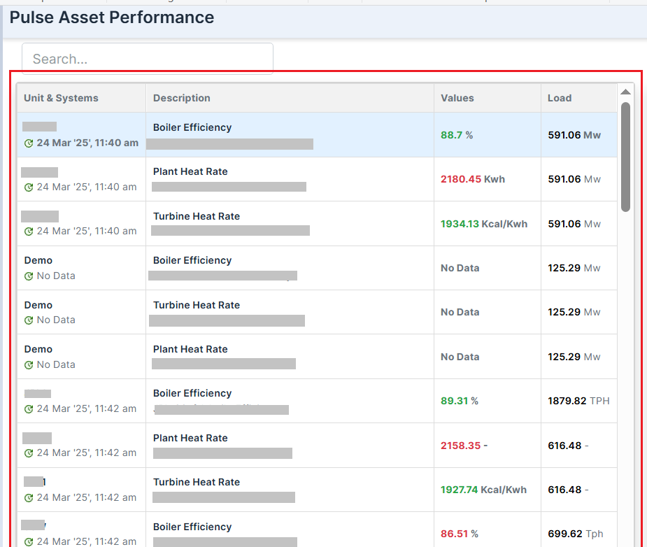
Figure 3. Unit and System List
- Displays monitored assets with their associated parameters and values.
- Columns:
- Unit & Systems: Displays unit names.
- Description: Indicates monitored parameters (e.g., Boiler Efficiency, Plant Heat Rate, Turbine Heat Rate).
- Values: Displays the measured or current values (e.g., 88.7%, 2180.45 Kwh).
- Load: Indicates the current or last known load values for the unit's displayed parameter (e.g., 591.06 Mw).
- Color Coding:
- Green values (e.g., 88.7%, 1934.13 Kcal/Kwh) indicate positive or optimal performance value.
- Red values (e.g., 2180.45 Kwh, 2158.35) indicate deviations from expected performance.
- No Data indicates missing or unavailable values.
¶ 4. Efficiency Graph (Right Panel)
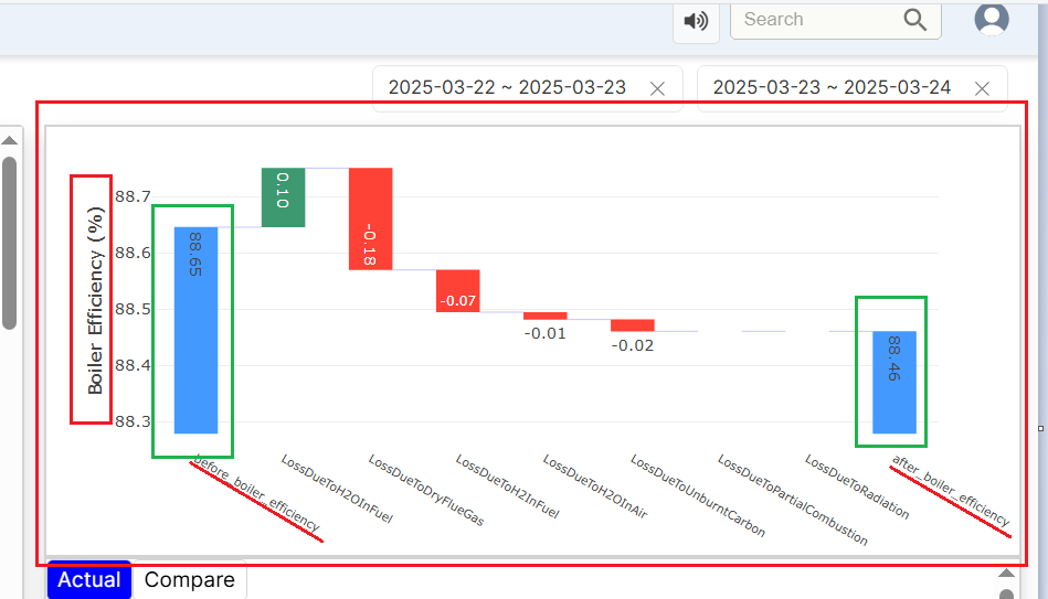
Figure 4. Efficiency Graph
Waterfall Chart Overview
The Waterfall Chart helps track efficiency changes over a selected period. Users can choose the date range from the top-right corner. For example, in the chart above:
- Boiler efficiency was 88.65% from March 22 to March 23, 2025.
- It dropped slightly to 88.46% from March 23 to March 24, 2025.
Understanding the Chart:
- Blue bars show the before and after efficiency percentages.
- Green bars indicate positive contributions (efficiency gains).
- Red bars represent losses due to specific factors (e.g., loss due to dry flue gas, loss due to H2O in the air, or more).
Each label highlights the reason for efficiency loss, such as:
- 0.18% loss due to dry flue gas
- 0.07% loss due to hydrogen in the fuel.
The system also sends notifications based on the chart to help users address efficiency concerns.
Customizing the View for graph:
If the user wants to analyze turbine efficiency or plant heat rate instead, simply select the desired parameter from the search bar on the left, click on the efficiency for the required parameter and the graph will update accordingly.
¶ 5. Actual vs. Design Comparison Table
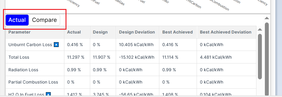
Figure 5. Actual Button Feature
Understanding the Bottom-Right Section of the Dashboard
This section, located below the graph, provides a detailed breakdown of key performance parameters:
- Actual: The real loss value of the parameter.
- Design: The expected value is based on the equipment’s design (the ideal target value).
- Design Deviation: The difference between the actual and design values, shows how much the system deviates from the expected performance.
Example:
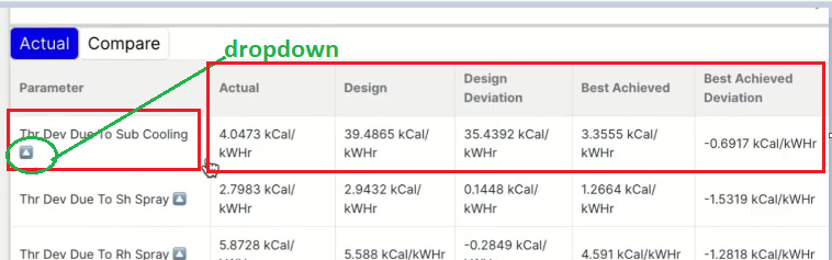
Figure 6. Parameter calculations
For Turbine Heat Rate (THR) due to sub-cooling:
- Design value: 39.4865 kCal/kW-hr (ideal expected performance).
- Actual value (loss): 4.0473 kCal/kWhr (measured loss).
- Design Deviation: 35.4392 kCal/kWhr (calculated as Design – Actual).
Additional Performance Metrics:
- Best Achieved: The best-recorded value (or median value) for the same load condition in the past year.
- Best Achieved Deviation: The difference between the current value and the best-recorded value, helping assess how much the system has drifted from its best performance.
This deviation helps assess how much the system is falling short of its ideal efficiency, allowing users to identify and address potential performance issues.
6. Compare button
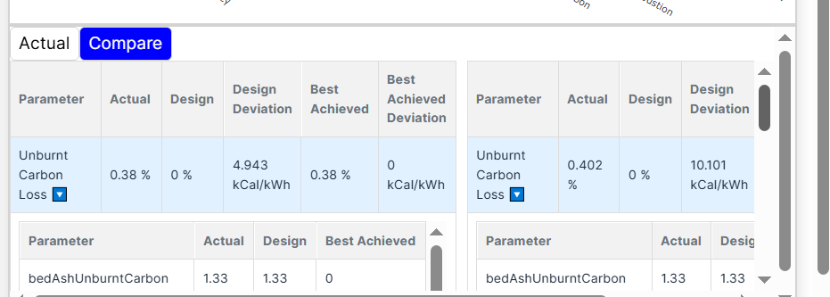
Figure 7. Compare Button
Understanding the Insights from the Comparison
The two tables displayed side by side compare different data sets based on the date ranges selected by the user from the top-right corner. The values shown reflect how key performance parameters have changed over time.
Key Observations:
- In the first set, Unburnt Carbon Loss is 0.38%, with a design deviation of 4.943 kCal/kWh for a one-time set.
- In the second set, Unburnt Carbon Loss increases to 0.402%, with a higher deviation of 10.101 kCal/kWh, indicating a decline in efficiency for another time set.
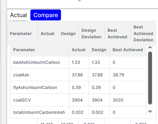
Figure 8. Dropdown calculations in Compare
Why This Matters:
Users can identify inefficiencies and take corrective actions to optimize asset performance by comparing different operational periods.
The dropdown next to "Unburnt Carbon Loss" provides access to the real-time data used in efficiency calculations. It allows users to see the exact values Pulse has used to determine key performance metrics.
For example, when Unburnt Carbon Loss was calculated:
- Actual Value: 1.33
- Design Value: 1.33
- Best Achieved Value: 0
Similar data is available for other parameters like Coal Ash, Flue Ash Unburnt Carbon, Coal GCV, and Total Unburnt Carbon Ash. Data of all these parameters were used to calculate the Unburnt carbon loss value.
This feature gives users transparency into how Pulse calculates Actual, Design, Design Deviation, Best Achieved, and Best Achieved Deviation values, helping them analyze performance with greater accuracy.
6. Buttons and Tabs
- Actual and Compare Tabs:
- Toggle between actual performance and comparison modes.
- Sound Button (Top Right):
- Allows enabling/disabling notifications or alerts.