¶ Incident Timeline
The Pulse Timeline Page provides a comprehensive view of operational deviations, warnings, and incidents over a selected timeframe. It allows users to monitor critical parameters, analyze anomalies, and take proactive measures to maintain system integrity.
This document explains all features and functionalities, including navigation, buttons, color-coded indicators, and interactive elements.
To access the timeline page.
Login to Pulse→ Click on Advance → Click on Timeline as Shown in the figure below.
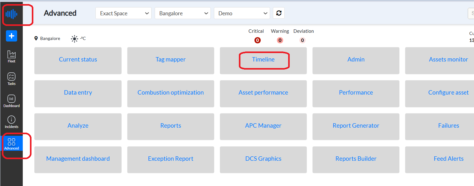
Figure 1. Pulse Advanced- Timeline
Users can also access Timeline through the Incidents page. At the top right corner of the page, Pulse can toggle from the Inbox option to Timeline.
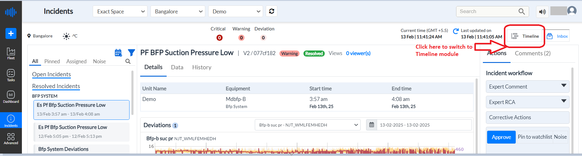
Figure 2. Timeline from Incidents Module
Let us go through the features of the Timeline Module of Pulse -
¶ 1. Left Top Section: Critical Warning Deviation
- Displays high-priority warnings and deviations.
- Alerts are categorized by severity, with three color-coded representations:
- Dark Red: Represents most critical incidents. These incidents require immediate attention without any delay.
- Medium Red: High-priority warnings requiring attention. the incident requires immediate attention but is not a top priority.
- Light Red: Less severe deviations. The incidents that deviate from expected values but do not require urgent attention.
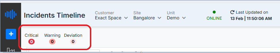
Figure 3. Highlighting Incidents’ criticality
¶ 2. Timeline View
The central area displays a time-based representation of incidents and anomalies across selected dates.
Key Features:
- Horizontal time grid: Represents days and weeks.
- Incident Bars:
- Different shades of red indicate incident severity, the darker the shade more critical the incident is.
- Clicking on an incident expands details and visual analytics.
- Failure Visibility Toggle:
- The "Show failures" checkbox, when enabled, highlights the time periods where the unit encountered unexpected failures. These failures are represented by a horizontal line spanning the corresponding duration on the timeline.
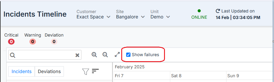
Figure 4. Click on Show failures
¶ 3. Date Selection Panel
- Located at the top-right corner.
- Allows users to select and modify the date range for which incidents should be displayed.
- Clicking the calendar icon opens a date picker for quick adjustments.
- Users can choose a date range for incident display, including month, quarter, custom range, and more.
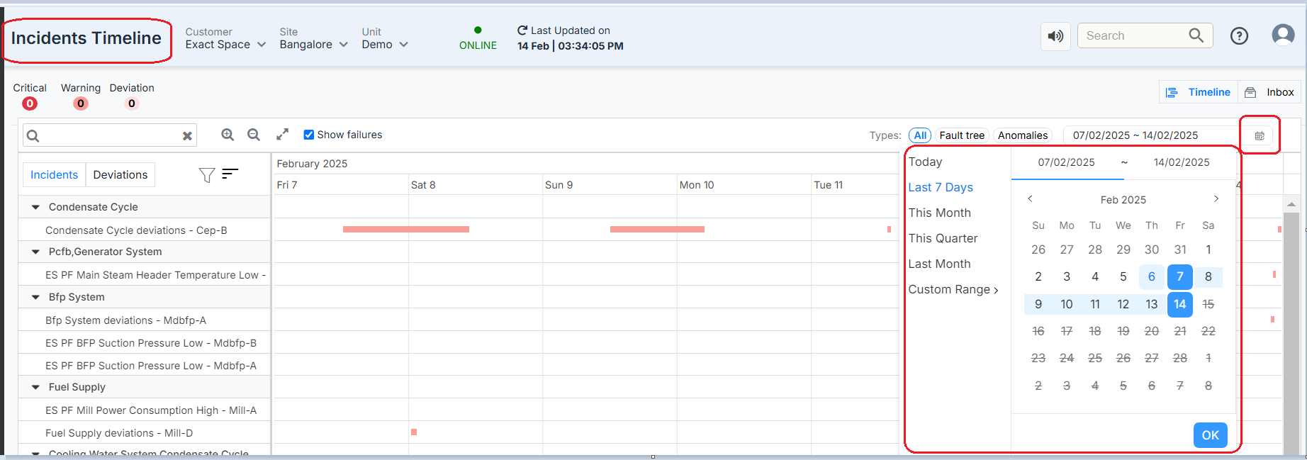
Figure 5. Date Selector
¶ 4. Zoom In & Zoom Out Buttons
- Enables users to adjust the timeline granularity.
- Zoom In ( + ): Provides a more detailed view of incidents displayed on the screen's center.
- Zoom Out ( - ): Expands the view to analyze a longer duration at a glance. This means the user can view more incidents as the screen shows a zoom-out version.
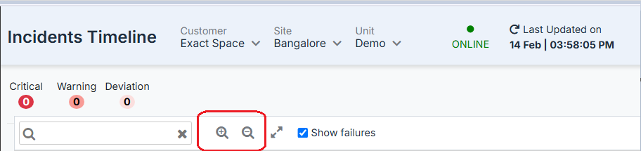
Figure 6. Zoom-in Zoom-out featured
¶ 5. Incident Details - Graphical Representation
Clicking on any specific incident in the timeline opens a detailed analysis panel with graphical insights. refer to the image below to understand the features and details of incidents shown by graphs.
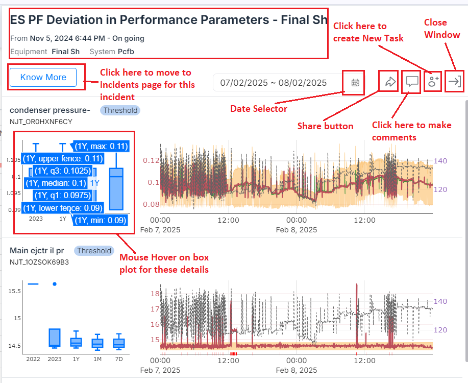
Figure 7. Incident details and graph
A. Header Section
- Title: "ES PF Deviation in Performance Parameters - Final Sh" – Indicates the nature of the issue and the associated system.
- Timestamp: Displays when the issue was first detected (Nov 5, 2024, 6:44 PM) and its ongoing status.
- Equipment & System:
- Equipment: Final Sh
- System: Pcfb
- Know More Button: Provides additional details on the incident, including related historical data, possible root causes, and recommendations.
- Date Range Selector: Users can adjust the analysis window to focus on a specific time range (07/02/2025 ~ 08/02/2025).
- Icons for Actions:
- Share: Allows users to share the incident details via a link or email.
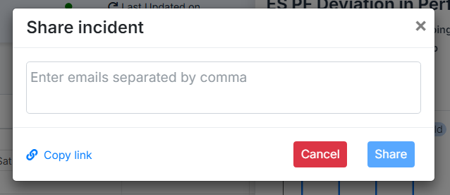
Figure 8. Share Incident Module
After sharing email through email, the user gets the following message on the email
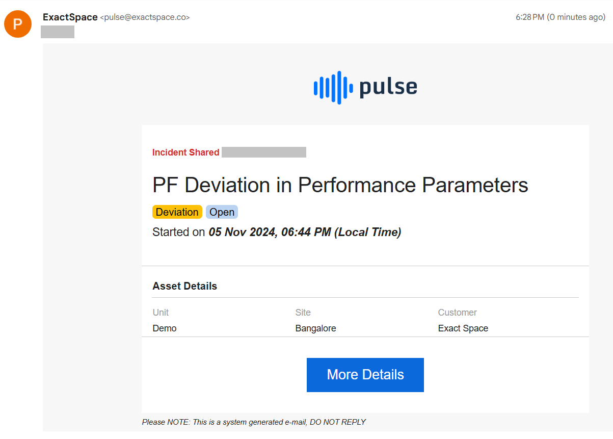
Figure 9. Email Notification of incident
Comments: Enables discussions and adding insights from users.
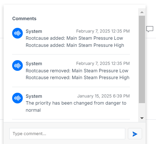
Figure 10. Comments Section
Add Task- - Clicking this button enables users to create a new task and customize its details, including assignees, status, priority, and subtasks for better organization and tracking.
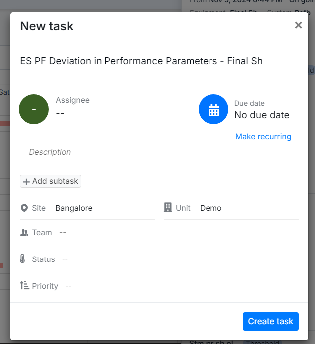
Figure 11. Creating a new task
Close Window: Closes the incident detail view and returns to the timeline main page.
B. Graphical Analysis Section
1. Condenser Pressure (NJT_0R0HXNF6CY)
- Box Plot Analysis (Left Side)
- 1Y max: 0.11 – Maximum recorded value in the last year.
- 1Y min: 0.09 – Minimum recorded value in the last year.
- Upper Fence: 0.11 – Threshold indicating an upper outlier boundary.
- Lower Fence: 0.09 – Threshold indicating a lower outlier boundary.
- Quartiles & Median:
- Q1 (25th percentile): 0.0975
- Q3 (75th percentile): 0.1025
- Median (50th percentile): 0.1
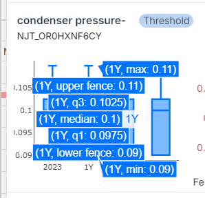
Figure 12. Details of Box Plot
- Time Series Graph (Right Side)
- Red Line: Actual recorded data points/ Actual values of data points.
- Black Dotted Line: Reference baseline values or the Load values.
- Green Line- Predicted values
- Yellow Band- Prediction Band which gives a range of expected values.
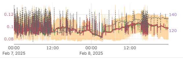
Figure 13. Incidents Time series graph
2. Main Ejector Pressure (NJT_1OZSOK69B3)
- Box Plot Analysis (Left Side)
- Historical Box Plots: Represent data distributions over different time frames (1 Year, 1 Month, 7 Days).
- Outlier Dots: Highlight extreme deviations.
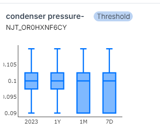
Figure 14. Box Plot
C. Threshold Indicators
Each parameter has a "Threshold" button indicating pre-set operational limits. Clicking on it provides details about upper and lower thresholds.
D. User Actions and Navigation
- Adjust Date Range: Modify time for analysis.
- Share & Comment: Collaborate with team members.
- Close Window: Exit the detailed incident view and return to the timeline.
E. Inbox Button (Top Right Corner)
- Clicking the Inbox icon navigates to the Incident Page, where all reported anomalies are listed in detail.
- Provides an option to filter incidents by severity, equipment, and system type.
F. "Know More" Button
- It provides an in-depth report on the selected incident by redirecting users to the Incidents module of the particular incident clicked on.
G. Share & Export Options
- Users can export incident reports for offline analysis.
- Allows sharing insights with team members via integrated collaboration tools.
H. Comment & Discussion Section
- Users can leave comments on incidents, fostering collaboration.
- It is helpful for maintenance teams to track issue resolution progress.
¶ Conclusion
The Pulse Timeline Page is a powerful tool for tracking, analyzing, and responding to operational anomalies. By utilizing visual indicators, interactive graphs, and filtering options, users can efficiently manage industrial incidents, minimize downtime, and enhance overall system reliability.