¶ Management Dashboard
The management dashboard offers clients a comprehensive view of the key tags they wish to monitor, and the resulting revenue outcomes-- highlighting savings or losses in Rupees. The revenue generated is visually represented in the graph, making it easy to interpret and analyze the insights derived from the configurations set up in the Process Parameters and Reliability section. This document provides a detailed explanation of the dashboard interface, its components, and functionalities, enabling effective monitoring, comparison, and performance analysis through intuitive visualizations and actionable data metrics.
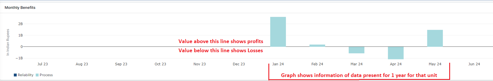
Figure 1: Management Dashboard
Refer to the figure above. Positive values on the graph indicate profits, while negative values represent losses. The graph displays data on revenue details for the unit over one year. The graph will reflect information for those specific months for which data is available. For the above graph, data is available only for four months within that year. The initial section of monthly benefits is calculated based on the reliability and process sections described below.
¶ Top Navigation Bar

Figure 2: Top Navigation Bar
-
Tabs:
-
Process Tab: Active by default, this tab shows process-related insights such as benefits and parameters.
-
Reliability Tab: Available for switching to reliability-focused metrics and analysis.
-
-
Export Button:
- The task is to import an existing unit's dashboard into a new unit; if not available, a new dashboard will be created for the new unit.
-
Preview Report Button on Process selection:
- Generate a concise preview of the process report and its key details associated with a specific tag for quick and easy review. Additionally, the report can be downloaded for future reference and offline use.
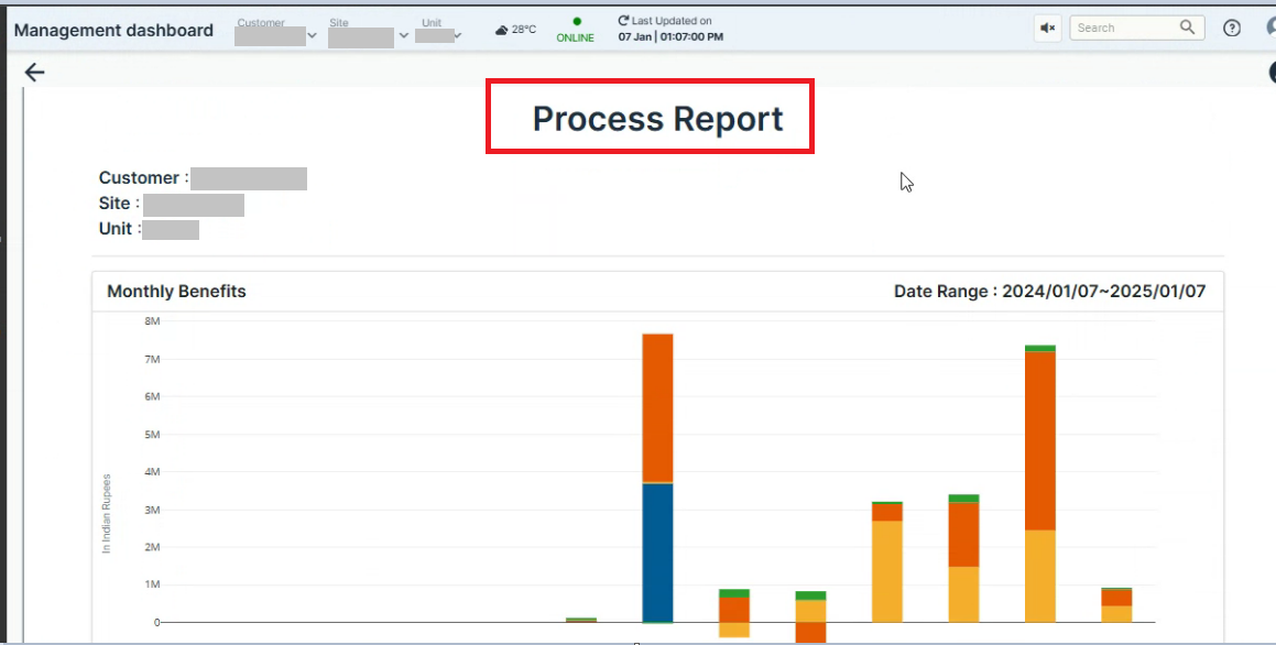
Figure 3. Process Report
-
Preview report button on the Reliability section:
- Clicking on the "Preview Report" for the Reliability section provides a quick view of the report and its details for easy review and access. Additionally, the report can be downloaded for future reference and offline use.
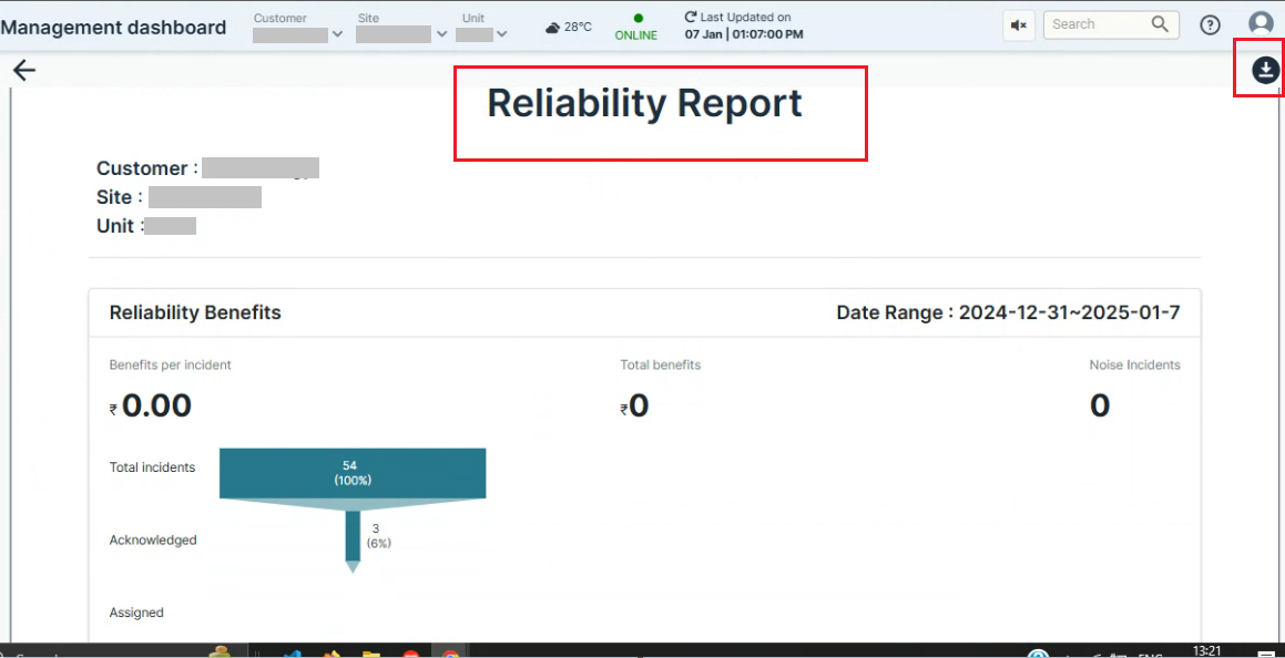
Figure 4. Reliability Report
-
Settings Icon (Gear Symbol):
- Provides customization options for the dashboard such as configuring filters, comparison metrics, or display preferences.
-
Add Parameter Button:
- Enables users to add new process parameters for monitoring or comparison. A dialog box likely opens to input details such as parameter name, threshold, and units. Click on "Add Parameter" to open a small window. This window allows the user to select parameters that impact the heat rate. The user has two options:
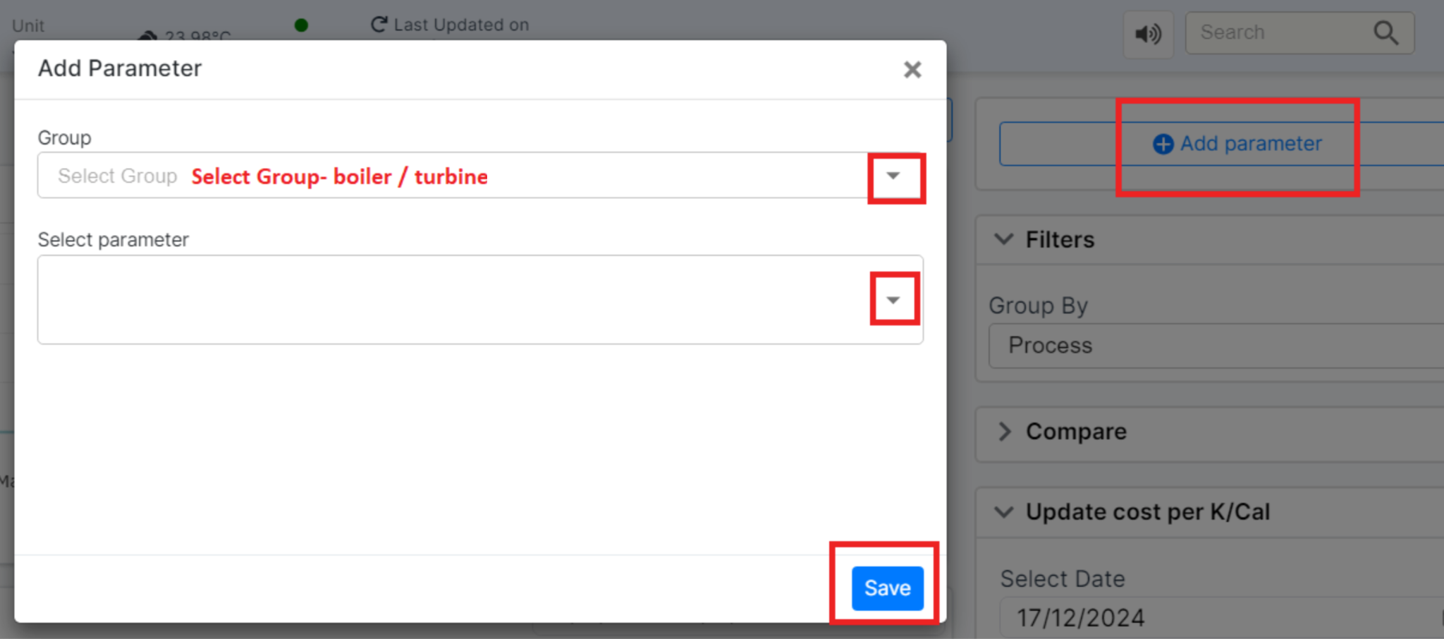
Figure 5: Add parameter window
-
Select Parameter:
- Choose from a list of predefined parameters that impact the heat rate.
-
Enter Keywords:
- Enter freeform keywords to search for related parameters. A list of parameters matching the keywords will be displayed for selection.
- After entering the necessary details, click "Save" to apply the changes.
Once the user selects the parameter bucket size, the value before the digital twin (known as the Baseline value), and the value they want to achieve for that parameter, the data is displayed in a tabular format. Although the Baseline value is automatically generated, it can be edited, and the values can be adjusted as needed.
The bucket size and Baseline value are automatically generated, while the user must input the target values for each load value and tag. Additionally, the user must enter the heat rate impact that the parameter has per unit change.
¶ Process parameters
The top panel in the process parameters section includes the following features:
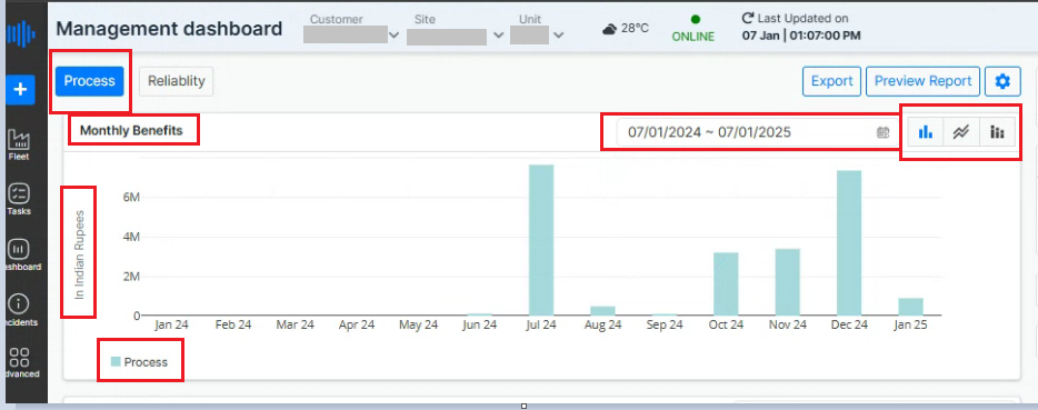
Figure 6: Top Panel
-
Date/Time Selection:
- Users can select the date or time for which they want to generate revenue reports.
-
Monthly Benefits Visualization
-
Graphical Representation:
-
This bar graph displays the Monthly Benefits in Indian Rupees (₹) over 12 months (December 2023 -- December 2024)by default. Dates can be selected.
-
The x-axis represents the months, and the y-axis represents the monetary benefit in Indian Rupees.
-
Each bar corresponds to the selected process (indicated by the color legend "Process" at the bottom left of the chart).
-
-
Date Range Selector (Top Right of Graph):
- Users can adjust the date range to analyze benefits for a specific timeframe.
-
View Options (Top Right Corner of Graph):
-
Bar Chart Icon: Displays data in bar chart form (default view).
-
Line Chart Icon: Converts the view into a line graph for trend visualization over time.
-
Stack chart: Presents data in a stacked bar chart format, where multiple data series are layered on top of each other within each bar. This visualization allows users to analyze the contribution of individual components to the overall total, making it easier to compare values across categories and identify patterns or trends within the dataset.
-
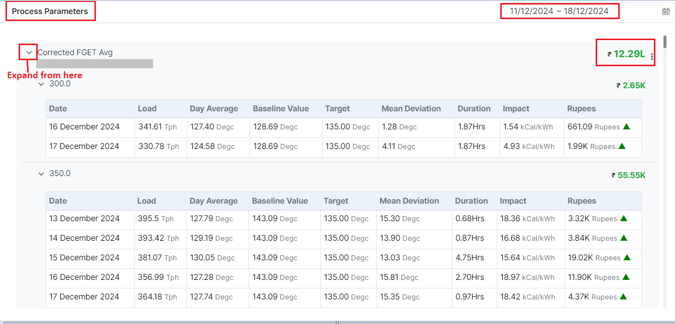
Figure 7: Process Parameters
In the process parameters section, each parameter entered by the user is listed. Users can expand each parameter to view detailed information, including its operational effects, financial implications (like cost per unit), and performance metrics. This feature helps users understand how each parameter impacts revenue generation, facilitating informed decision-making and strategic planning.
This section thus details how the "Corrected FGET AVG" parameter impacts both operational efficiency and financial metrics, providing essential data for analysis and decision-making. The negative values in impact and rupees with a small inverted red triangle indicate areas where performance and costs can be optimized.
Below is an explanation of each field, using the first row from the image as an example:
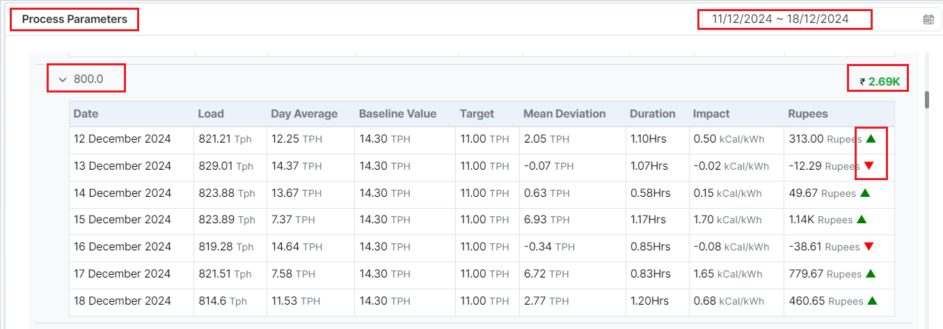
Figure 8: Process Parameters
-
COMP-1 BED LVL TX
Description: The main identifier/parameter for the component being monitored. A unique identifier or tag associated with the parameter or sensor is given just below the main identifier. -
₹ 2.69K
Description: The total cost impact associated with this parameter for the selected time period, indicating a net positive revenue or efficiency gain during the monitoring period. -
Date:
- Description: Data is recorded for various load values on specific dates.
Example: 12 December 2024 - 18 December 2024, data is recorded for load values like 821.21 Tph, 829.01 Tph, etc.
- Description: Data is recorded for various load values on specific dates.
-
Load:
-
Description: The load measurement, typically expressed in tons per hour (Tph), represents the operating load of the system or boiler being monitored.
Example: -
12 December 2024: 821.21 Tph
-
13 December 2024: 829.01 Tph
-
14 December 2024: 823.88 Tph
-
-
Day Average:
-
Description: The average value of the parameter observed over the day, expressed in TPH.
Example: -
12 December 2024: 12.25 TPH
-
13 December 2024: 14.37 TPH
-
-
Baseline Value:
-
Description: The baseline or reference value for the parameter, derived from benchmarking or tag meta.
-
Example: 14.30 TPH across all dates.
-
-
Target:
-
Description: The target value set for the parameter, representing the optimal operating condition.
-
Example: 11.00 TPH across all dates.
-
-
Mean Deviation:
-
Description: The deviation of the parameter from its target value.
Example: -
12 December 2024: 2.05 TPH
-
13 December 2024: -0.07 TPH
-
-
Duration:
-
Description: The time for which the parameter ran for a particular load.
Example: -
12 December 2024: 1.10 Hrs
-
15 December 2024: 1.17 Hrs
-
-
Impact:
-
Description: The impact of the parameter deviation on performance or efficiency, measured in kilocalories per kilowatt-hour (kCal/kWh).
Example: -
12 December 2024: 0.50 kCal/kWh
-
16 December 2024: -0.08 kCal/kWh
-
-
Rupees (Revenue):
-
Description: The financial impact of the parameter deviation. Positive values indicate revenue gains, while negative values indicate a cost.
Example: -
12 December 2024: 313.00 Rupees (▲)
-
13 December 2024: -12.29 Rupees (▼)
-
15 December 2024: 1.14K Rupees (▲)
-
Note: Green arrows (▲) indicate a positive revenue impact, while red arrows (▼) indicate a negative financial impact during the selected date and time.
Edit and Delete Option
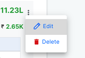
Figure 9: Edit and Delete option
When edit option is clicked, the following dialog box appears,
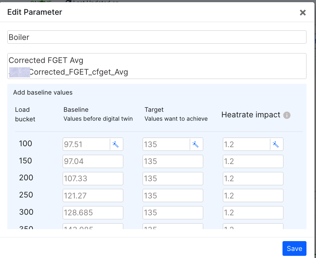
Figure 10: Edit window
The Boiler/Turbine and the FGET value aren't editable. The user can edit the Baseline, Target and the Heatrate impact for various bucket sizes.
The user can also use the "wand" icon to automatically fill in the value.
The user can also delete the selected parameter by clicking the delete option.
¶ Reliability
Purpose:
Reliability Metrics provide a high-level view of the system's performance over time, particularly focusing on cost savings and overall financial impact.
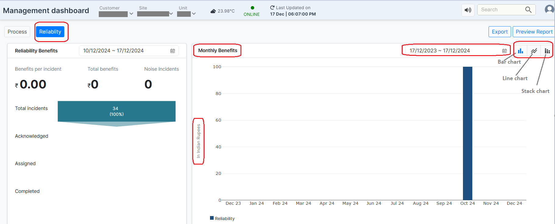
Figure 11: Reliability tab
Clicking on the Reliability tab reveals two subsections:
- Right Side: Features a graphical representation of monthly benefits. Users can specify the desired time slot for viewing profits, and the graph will dynamically display the monthly benefits for the selected period.
The graph can be viewed in three formats---Line Chart, Bar Chart, and Stack Chart---allowing users to choose the display option that best suits their needs. The figure below shows the Bar Chart view of the profits graph for October.
Features:
-
Monthly Benefits Section:
-
This section displays monthly financial benefits in a graphical format.
-
It helps to track benefits in Rupees (in Millions) across specific months
-
It offers visual insights into how the system's efficiency improvements translate into cost savings over time.
-
Benefit: Quick identification of months with significant gains, enabling targeted actions to replicate success.
-
-
Left Side: The left section provides details on the status of incidents that have been acknowledged (approved), how many tasks have been created and assigned for incidents, how many incidents have been completed, and how many incidents have been rejected which are moved to Noise incidents.
In the example below, out of 100% (234 incidents) of incidents, 3% (8 incidents)have been acknowledged. Additionally, tasks have been created and assigned for 1% (i.e. 3 incidents) of the incidents. 67% of the incidents are resolved and completed. 7 incidents out of 234 have been moved to noise incidents
Benefits per Incident: At the end of the process, if users perceive any benefits from resolving the acknowledged and assigned incidents, these will be reflected under the Benefits per Incident and Total Benefits section. So total benefits from all the incidents can be seen as Rs 50 while the Benefit per incident is Rs 25
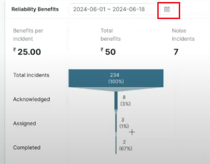
Figure 12: Reliability Benefits of Selected date range from Management Dashboard
¶ Right Side Panel
¶ Filters
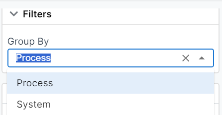
Figure 13: Filters
Group By Dropdown:
This feature allows users to group data based on specific categories---Process or System.
- Process (Default Selection): Displays the graphical data as an overall representation of the entire process, providing a holistic view of the process performance.
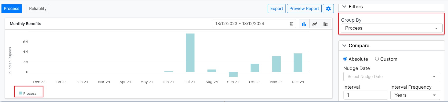
Figure 14: Management Dashboard (Bar chart, sorted by process)
- System: Break down the graphical display to represent data for individual systems within the process, such as turbines, fans, or other components. This enables users to analyze performance and trends for each system separately, offering more granular insights.
 {width="7.146883202099738in"
height="1.6111111111111112in"}
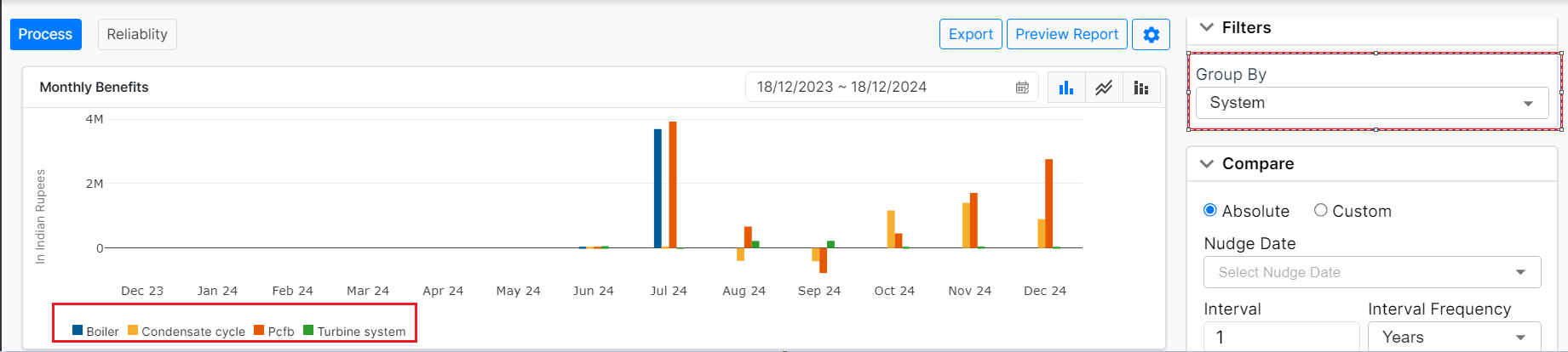
Figure 15: Management Dashboard (Bar chart, sorted by system)
¶ 4.2 Compare Section
-
Absolute / Custom Toggle:
-
Absolute: Default view; compares the current data without user-defined custom changes.
-
Custom: Allows users to set specific custom parameters or metrics for comparison.
-
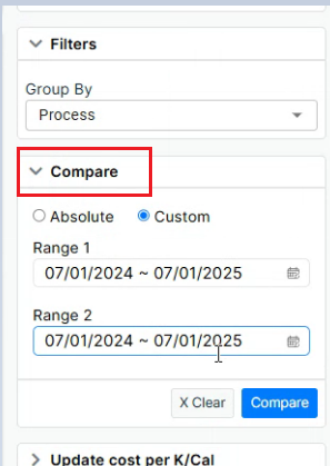
Figure 16. Compare Section
- Nudge Date Selector: Allows users to select a specific "nudge date" to perform a comparative analysis of process parameters. The feature analyzes data for a defined interval, such as two months before and after the selected date. A comparative graph is generated to visually display performance trends and deviations across these periods, enabling users to identify improvements, anomalies, or patterns effectively.
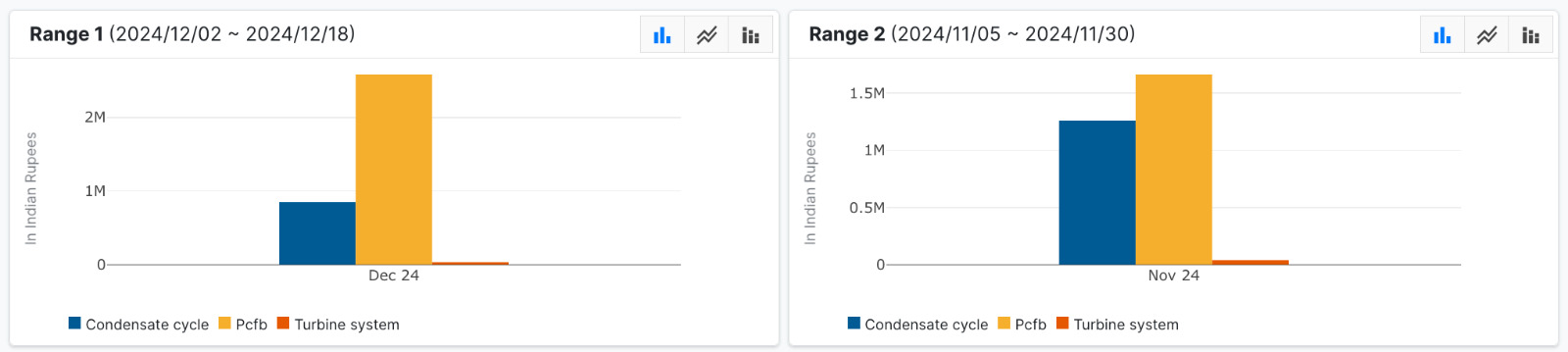
Figure 17: Comparison of two different time ranges
-
Interval and Interval Frequency:
-
Users can define the comparison period:
-
Interval: Number of units (e.g., 1).
-
Interval Frequency: Time unit (e.g., Years, Months, etc.).
-
-
-
Compare Button:
- Initiates the comparison analysis based on the input criteria. Clicking on this button displays two graphs on the left-hand side comparing data for the above-selected nudge dates.
-
Clear Button:
- Resets all fields in the "Compare" section.
¶ Update Cost per K/Cal
-
Users can view financial impacts due to operational performance over a specific period.
-
A "Cost per K/Cal" metric is displayed, which reflects energy cost efficiency.
- Example: 0.0021 per K/Cal.
-
It helps to dynamically update this value to see real-time changes in cost impact.
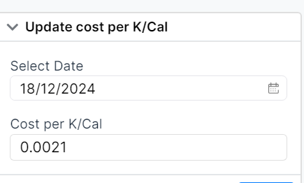
Figure 18: Update Cost per K/Cal