¶ Introduction
The DCS Graphics module in Pulse gives users a visual representation of industrial processes and plant operations. It provides a drag-and-drop interface to replicate actual plant layouts using configurable equipment blocks and connectors. Each equipment can be linked to real-time status tags, giving users a dynamic view of plant health and operations.
It enables users to create schematic diagrams of systems such as water treatment, boiler control, chemical dosing, etc., by placing components, linking them with data, and monitoring real-time status. This module serves as a crucial interface between process data and operational decision-making for clients in domains like power plants, water treatment, and manufacturing. The figure below illustrates how users can create a replica of the actual plant.
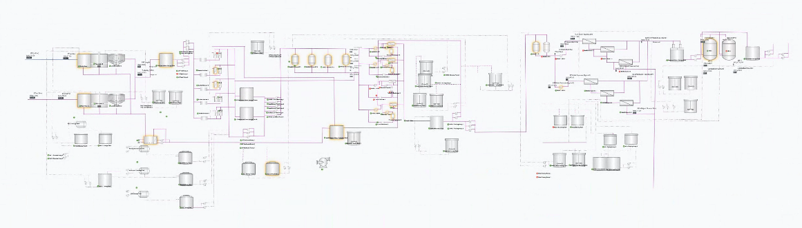
Figure 1. Example of plant replica using DCS graphics
¶ 1. Accessing the DCS Graphics Module
Steps to Login:
- Go to the Pulse platform login page.
- Enter your valid credentials.
- Once logged in, navigate to the left panel and click on Advanced.
- Under the Advanced section, click on DCS Graphics.
The user will now be redirected to the DCS Graphics workspace.
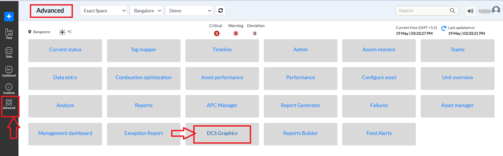
Figure 2. How to reach DCS graphics module- Pulse
¶ 2. Module Importance for Power Plants and Industrial Clients
The DCS Graphics module plays a crucial role in enabling power plant teams to run operations smoothly and efficiently. It brings all the equipment and their working flow onto a single screen, giving users a clear, real-time view of the entire plant.
Different colors and blinking indicators on the equipment help users quickly identify which parts of the plant are functioning normally and which ones require attention. This visual system highlights critical equipment, so plant operators can focus on what matters most and take timely action to prevent issues.
By showing live data and equipment status in one place, the module helps:
- Quickly detect problems or unusual behavior.
- Prioritize critical equipment that needs urgent care.
- Make faster, more informed decisions.
- Reduce unplanned downtime and improve maintenance planning.
Overall, the DCS Graphics module makes complex operations easier to manage and supports safer, more reliable power plant performance.
¶ 3. Accessing the Visualization Module
- From the DCS Graphics section in the main navigation:
- Users are directed to a blank visualization canvas.
- If any prior visualizations have been created, they will appear as thumbnails at the top.
- To create a new schematic:
- Click on the ‘+’ button located on the top navigation bar.
- This opens a new blank canvas for the user to start designing.
¶ 4. Overview of User Interface
¶ 4.1 Top Toolbar (Left to Right)
- Flow Tabs: Switch between different graphic flows or system diagrams. These schematics are created by users and access is restricted based on user permissions. (e.g., Flow 1, test, wws test, Test1, one component, and more): Quick test/save configurations. [Refer to figure 3]
- Project Dropdowns: Select project site, client name, and unit.
- Save Changes: Save the current layout and configurations.
- Date Selector: Filter data by date range.
- Settings (Gear Icon): Clicking on this displays the left toolbar used to design the layout.

Figure 3. Top bar of DCS graphics
Table 1. UI element and description for top bar features
| UI Element / Field | Description |
| Save Changes | Saves the current state of layout and data binding |
| Provide a name | Input box for naming the design |
| Cancel | Cancels the design editing |
| Today (Calendar) | Used to filter/view data by date |
| Search | Search functionality at the top right (this is a general feature of Pulse) |
| Settings Icon (Top Right) | Open the tools panel on the left sidebar to access equipment and connectors. |
| ‘+’ Button (Top Bar) | Create a new visualization layout for your plant. |
Refer to the image below corresponding to this table.
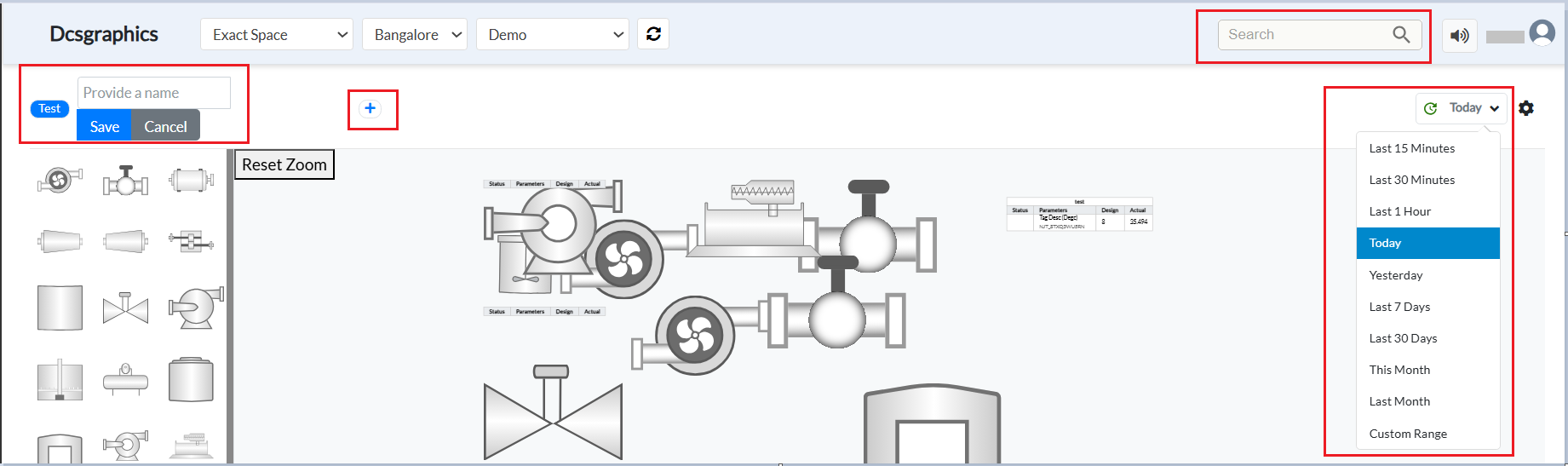
Figure 4. Image corresponding to table features and description
Four types of elements can be added from the left panel:
- Edge Line – Used to connect two images to represent a relationship or flow between them.
- Single Parameter – Represents a single tag or data point.
- Multiple Parameters – Used to display more than one tag or data point.
- Images – Any element that is not an edge line or parameter is treated as an image. Users can click and drop images from the left panel to the canvas.
Let’s see how to add these elements to the canvas.
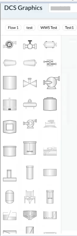
¶ 4.2 Left Panel
- Component Library: Click-and-drop symbols (tanks, valves, blowers, pumps, etc.)
Table 2. UI element features and description for the left panel
| UI Element / Field | Description |
| Component Library | List of visual elements like tanks, valves, etc. |
| Equipment | One of the items inside the equipment is edgeLine, which is used to connect/ link equipment. |
| Equipment Panel (Left Sidebar) | Drag and drop equipment icons here to build your schematic. |
- Multi-parameter Table Option: Insert a table to display multiple tag values for a selected unit.
Figure 5. Connectors
¶ 4.3 Canvas Area (Center)
- Diagram Workspace: Where components are placed, arranged, and connected.
- Real-time Status: Displays status indicators (green, orange, yellow, red).
Table 3. UI element features and description for canvas(center) area
| UI Element / Field | Description |
| Canvas | For your drawing area, arrange and connect the equipment here. |
| Table Icon | Adds a table to view multi-parameter tag data |
| Actual Tab | Shows real-time data collected from field devices |
| Reset Zoom | Reset the center area where equipment and connectors are placed |
| Status Tag | Required tag that reflects the equipment's live operational status. |
| Aggregators (Table View) | Determines how multiple values are summarized (eg. FIRST, MAX, AVG) |
¶ 4.4 Right Panel
When a user adds a component from the left panel, it appears on the canvas. To assign tags, data, and values to this component, the user must click on it—this action triggers the right panel to open. The panel displays the default internal name assigned to the component or equipment, which can be edited in the first section at the top of the panel.
The right panel is draggable, allowing users to reposition it in case it obstructs their view of the canvas.
This panel is divided into two sections: Data and Config. The panel heading displays either the default name of the component (as dragged into the view) or a custom name provided by the user in the config field.
¶ 4.4.1. Data Section
- Shows the status tag, defined using aggregators and values configured by the user.
- Useful for users who want to monitor specific tag values, such as KPIs.
- Displays all other tags associated with the selected component under the “All Tags” category.
- Lists incidents and root causes and recommended actions related to these tag values.
- Includes a summary of open and resolved incidents.
Refer to the image below for a detailed view of the data section in the right panel.
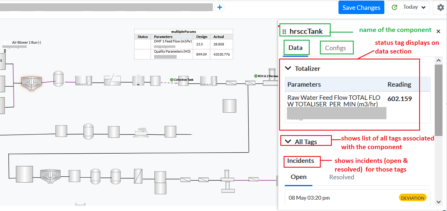
Figure 6. Config section of the right panel
¶ 4.4.2 Config Section
The Config section allows users to customize how a component is displayed and configured within the canvas. It includes the following fields:
- Name: Specify a custom name for the selected component. This name will be displayed at the top of the right panel upon selection, replacing the default label. You can update it as needed to match your preferences
- X-Axis / Y-Axis:
- These fields define the component’s position on the canvas.
- Users can either manually enter the X and Y values or drag the component within the canvas—this will automatically update these fields.
- Size:
- Defines the size of the component.
- This can only be modified via the right panel, not by interacting with the canvas directly.
- Rotation:
- Enter a rotation angle to rotate the component clockwise or counterclockwise. Use values from 0 to 360 for clockwise rotation, and 0 to -360 for counterclockwise (anticlockwise) rotation.
- Status Tag:
- Used to highlight specific tags (such as KPIs) for the component.
- These tags and their values are displayed separately in the Data section for prioritized viewing.
Clicking the scroll icon on the right displays a list of available tags linked to the component. Users can:
- Select one or more tags as Status Tags.
- Configure the tag’s X Offset, Y Offset, and Scale Size (which controls the visual size of the tag).
- Create multiple sections to group status tags as needed.
- To remove a section, click the red Delete icon next to it.
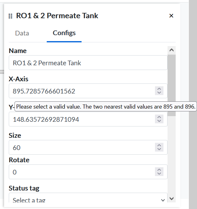
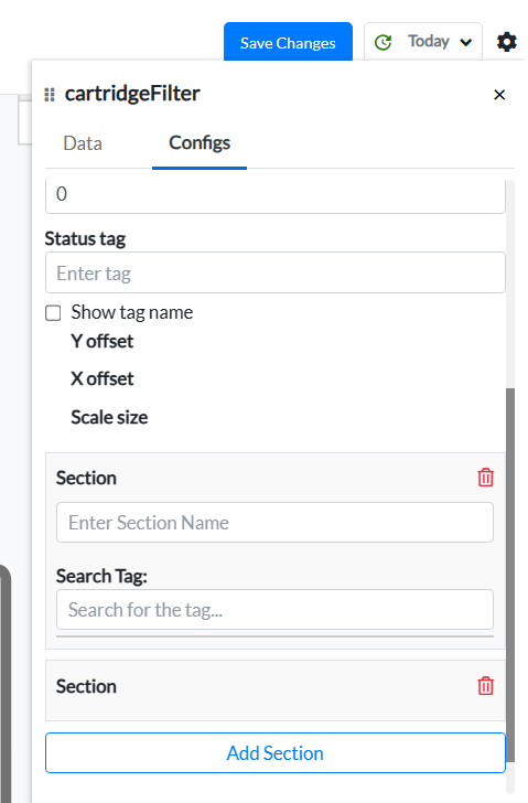
Figure 7. Details of Right panel (for reference -RO1 & 2 Permeate Tank and cartridge filter)
Table 4. Field Configurations for the Right Sidebar
| Field / UI Element | Description |
| Equipment Name | Name or label displayed on the equipment for visual reference. |
| X Coordinate | Set the horizontal position of the equipment on the canvas. (Dragging a component on the canvas also updates its 'X Coordinate) |
| Y Coordinate | Set the vertical position of the equipment on the canvas. (Dragging a component on the canvas also updates its 'Y Coordinate) |
| Size | Controls text/icon size |
| Rotate | rotates the equipment to the degree mentioned by the user |
| Scale Size | Size of the icon in proportion to the default |
| Search Tag | Used to link a process tag to the selected component |
| Aggregators | Choose how to display data (e.g., MAX, MIN, AVG) |
| Add Tag Section | Add custom tags and labels to enrich equipment data. |
| Additional Tags | Users can define custom tags. Steps:1. Enter a name for the additional parameter.2. Select or create a tag from the list. This helps bind live data to the visualization. (See Image 7 for reference.) |
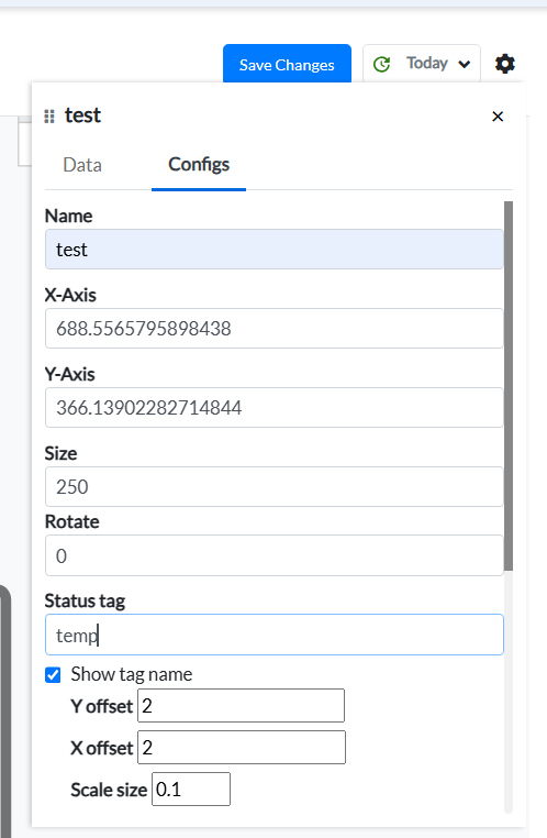
Figure 8. Details on the right sidebar
¶ 5. Drawing and Configuring Components
Steps to Draw a System:
- Components are added to the canvas using a click-to-drop method
- Click to select a component to see the right-side configuration panel.
- Click on the Single Parameter icon to add a table for a single data point, or the Multi-Parameter icon to add a table that includes multiple data points. Use the EdgeLine icon to add connectors or link different images and tables.
The image below illustrates which icons are used for Single Parameter, Multi-Parameter, and EdgeLine. All other icons represent static images. Users can use connectors/EdgeLines to visually relate images and parameter tables for better clarity.
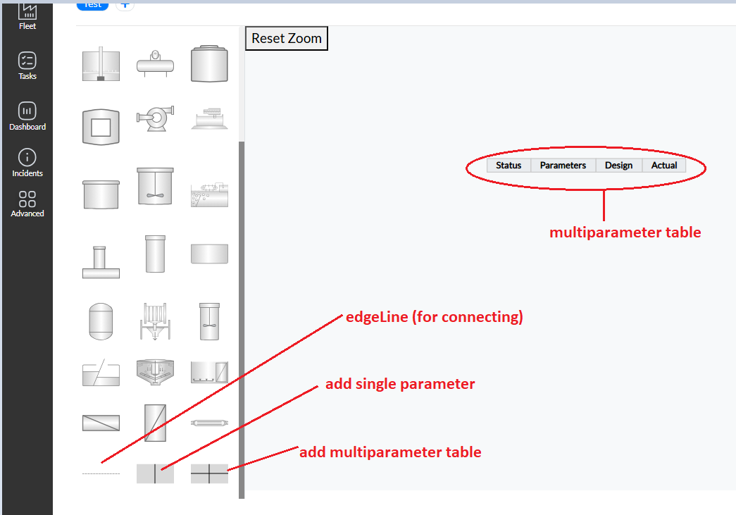
Figure 9. Single, multiple parameter and EdgeLine
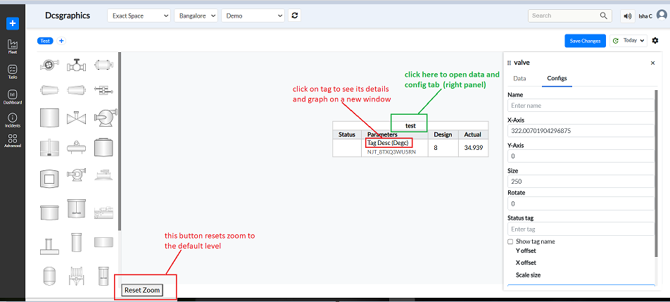
Figure 10. Multiple parameters and Reset Zoom button
- Use X Offset and Scale to reposition and resize for positioning the name of the component.
- Use the ends of the lines to drag them to link components and indicate flow.
- When the user clicks on a tag—whether for a single or multiple parameters—they are redirected to a new window that displays all relevant details in a graphical format. Refer to the image below to view the new window.
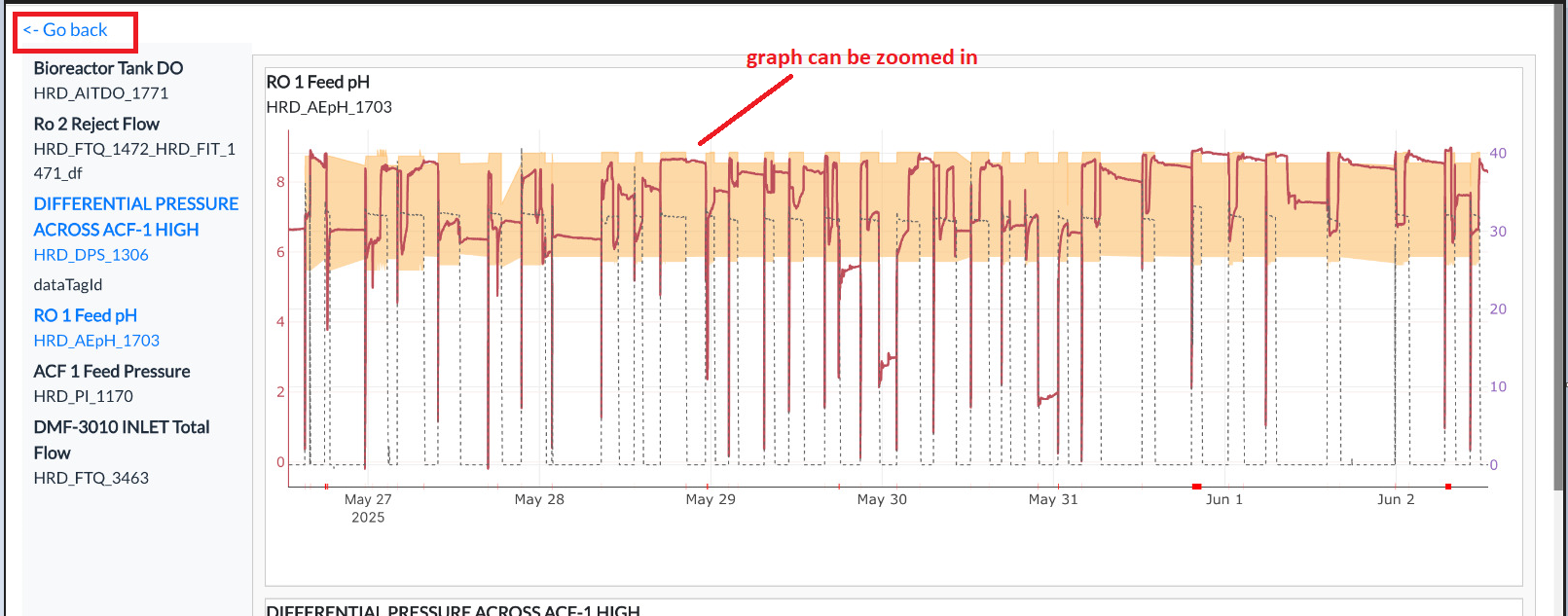
Figure 11. Graphical representation of Tags for single and multiple
- Reset Zoom button- The "Reset Zoom" button typically restores the view to its default zoom level. The latest version has a Reset Zoom button on the right bottom corner as shown below.
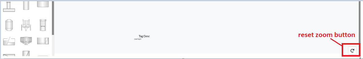
Figure 12. Reset Zoom button
- For certain images used in water treatment plant configurations, a "Level Change" option is available under the Config tab. This option is applicable only in specific cases where it is required, and not for all images, as illustrated below.
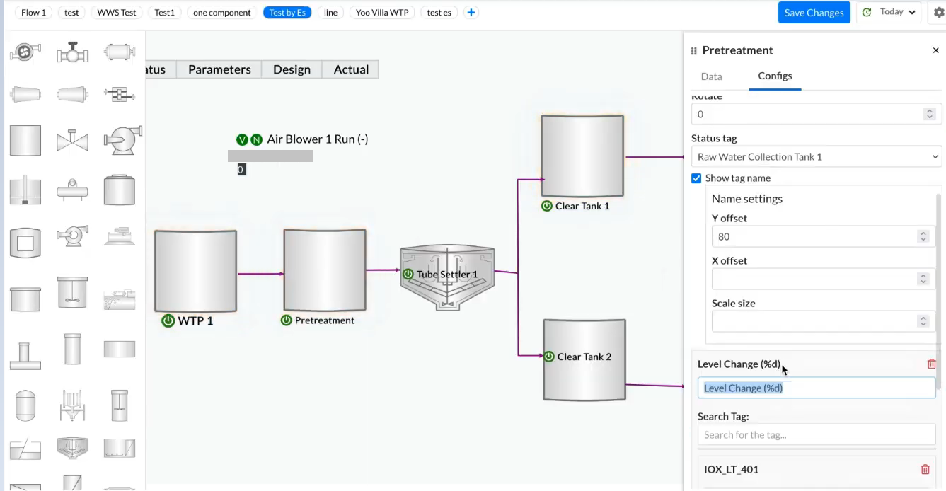
Figure 13. Adding level change and other information for plant replica
¶ 6. Adding Tags and Data for Image components
- In the Configs tab, go to Search Tag.
- Enter the tag name.
- Select an aggregator from the dropdown (e.g., FIRST, MAX, AVERAGE). This is optional — users may choose not to select any aggregator for the tag if they prefer.
- The selected tag now appears in real-time on the component.
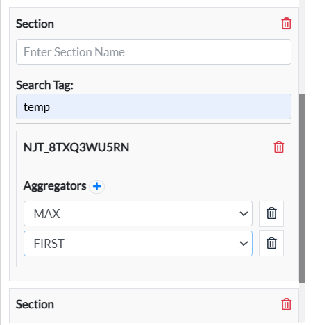
Figure 14. Adding tags and data for an image component
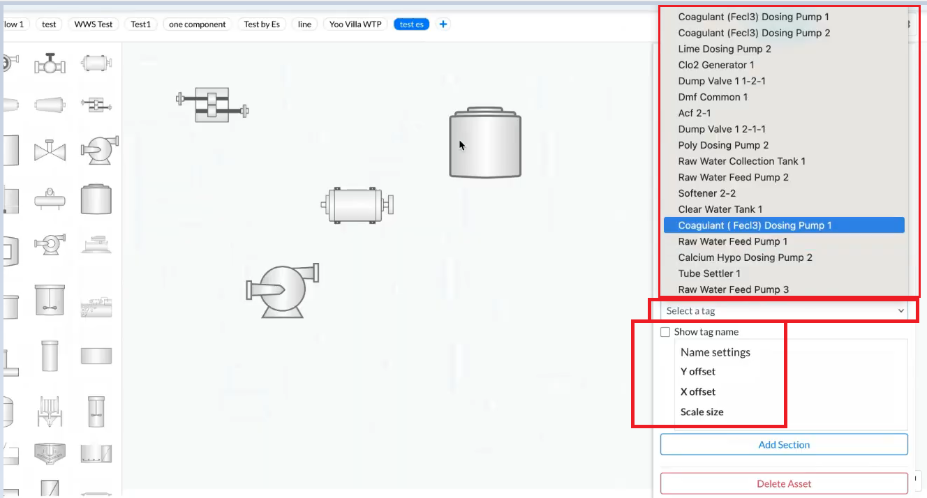
Figure 15. Adding tags and data
¶ 7. Adding Multi-parameter Table
- On the left panel, select the multi parameter table icon.
- Click and drop it on the canvas.
- On the right panel, select the tags to be shown.
- Choose aggregators for each tag if required.
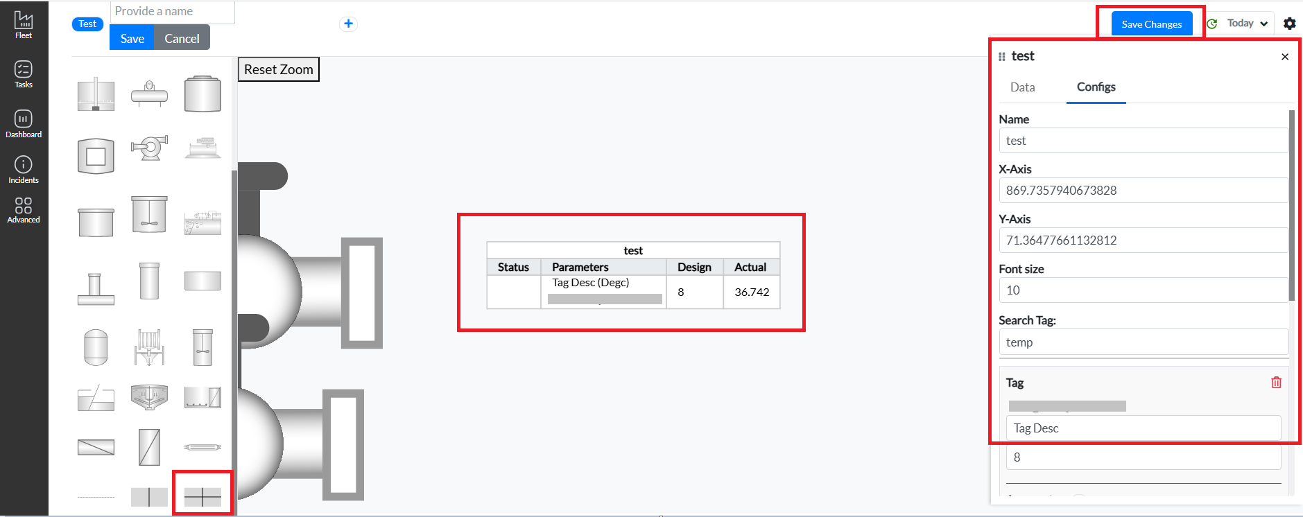
Figure 16. Adding multi-parameter table
Pulse DCS Graphics enables intuitive monitoring by color-coding components based on their status tags. Additionally, a distinct color code is used for the power icon displayed next to each component name.
- green – equipment is ON
- red – Equipment is OFF
The status is determined based on the status tag configured by users in the right panel. Refer to the image below to understand this.
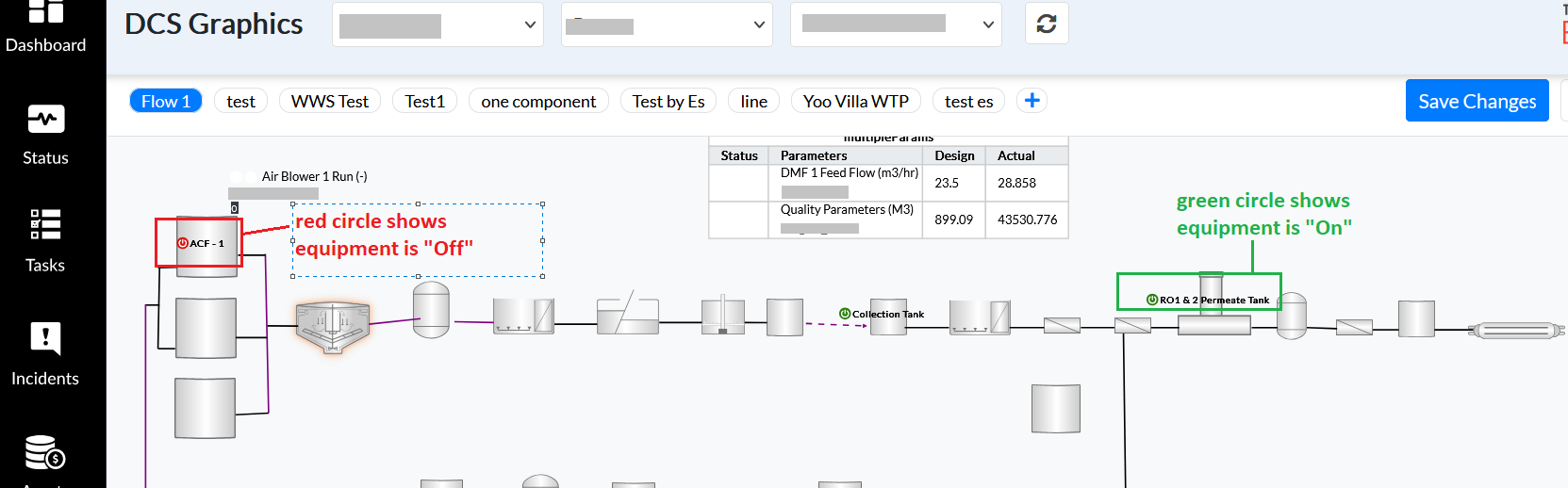
Figure 17. Equipment “On” and “Off” symbol
Pulse DCS graphics also provide a feature for each component which glows based on the highest severity of incidents associated with its respective equipment based on its tag and data value-
- red – at least one critical incident is present
- orange – warning-level incident(s) found, but no critical ones
- yellow – only normal-priority incident(s) found, no critical or warning
- no glow – no incidents found for the equipment of the component
These colors are dynamically applied once tag thresholds are configured. It allows users to immediately recognize and address plant issues. Refer to the image below to understand the color code.
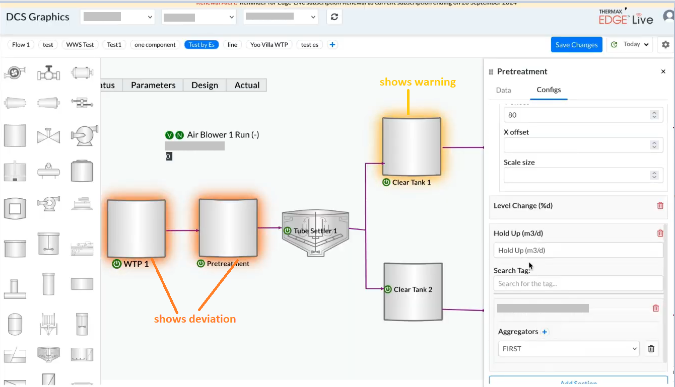
Figure 18. Adding color code to show severity level
¶ 9. Best Practices
- Use clear and distinct names for each piece of equipment for easy identification.
- Use connectors meaningfully to replicate real-world logic/flow.
- Use the multi-parameter table to avoid clutter.
- Always add a status tag to each piece of equipment to ensure visibility into live conditions.
- Regularly save your schematic after updates.