¶ Failures
To reach the Failures page of Pulse
-
Log into the Pulse data center.
-
Click on "Advanced"
-
Click on "Failures"
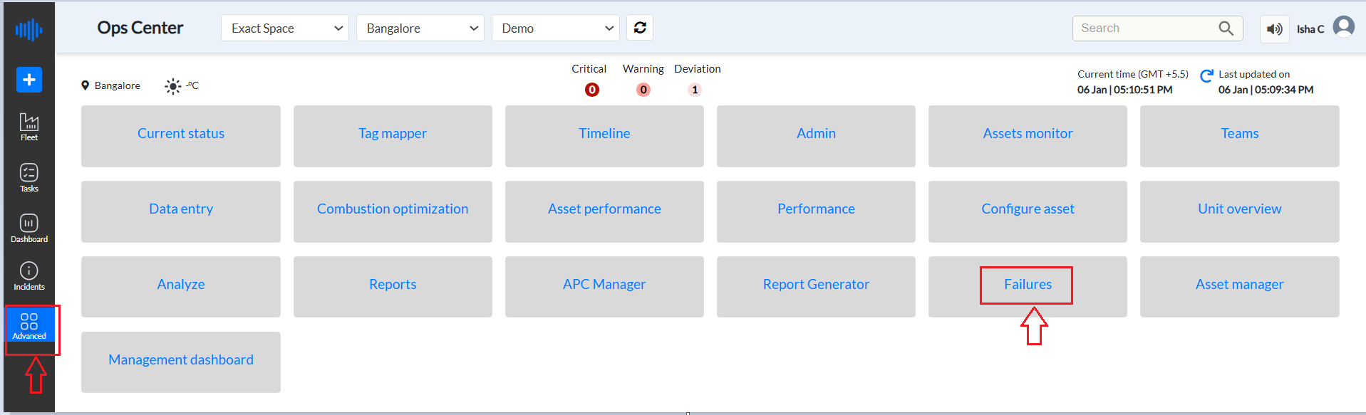
Figure 1: Failures tab from Advanced menu
¶ Purpose
The Failures Page functions as a detailed log, capturing all incidents of failure or complete shutdowns in power plant units. This includes both planned and unplanned events resulting from improper functioning.
This page is a critical tool for maintaining the operational integrity of power plant units. By systematically recording and analyzing failures and their impacts, it supports continuous improvement in plant reliability, safety, and efficiency. The additional sections provide key performance metrics at a glance, helping stakeholders quickly assess the unit's performance and identify areas for improvement.
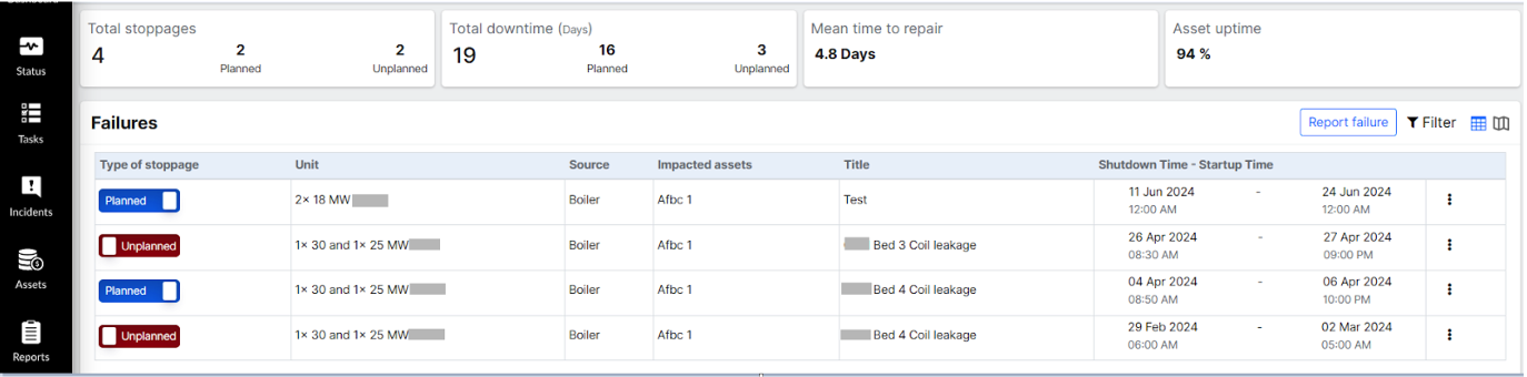
Figure 2: Failures History
¶ Stoppages Overview
This section provides a quick snapshot of the total number of stoppages, differentiating between planned and unplanned events.
-
Total Stoppages: The aggregate number of all stoppages (including planned and unplanned).
-
Planned Stoppages: Number of stoppages that were scheduled for maintenance or other planned activities.
-
Unplanned Stoppages: Number of stoppages that occurred unexpectedly due to malfunctions or other unforeseen issues.
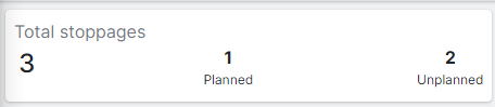
Figure 3: Total stoppages in Failure History
¶ Downtime Overview
This section details the total downtime experienced by the unit, with separate breakdowns for planned and unplanned downtime. Downtime (days) refers to the total duration, measured in days, that a power plant unit is non-operational due to a failure or planned maintenance. This metric is crucial for assessing the reliability and efficiency of power plant operations.
Importance
-
Operational Efficiency: This helps evaluate how often and for how long a unit is offline, impacting overall power production.
-
Maintenance Planning: Assists in scheduling maintenance activities by understanding the historical downtime trends.
-
Performance Benchmarking: Allows comparison of downtime across different units or time periods to identify areas for improvement.
Components of Downtime
-
Planned Downtime:
-
Scheduled interruptions for maintenance, upgrades, or inspections.
-
These pre-arranged activities usually occur during periods of low demand to minimize impact.
-
-
Unplanned Downtime:
-
Unexpected interruptions due to equipment failure, safety issues, or unforeseen incidents.
-
These events are typically more disruptive as they can occur suddenly and require immediate attention.
-
Calculation
-
Total Downtime: The sum of all periods during which the unit is non-operational.
- If a unit is down for maintenance from June 1st to June 3rd (3 days), and then experiences an unexpected failure from June 10th to June 12th (3 days), the total downtime for the month would be 6 days.
-
Downtime for Planned Events: Total duration of scheduled outages. It includes the sum of the durations of all planned maintenance activities.
- For the above example, the planned downtime is 3 days. Total duration of scheduled outages.
-
Downtime for Unplanned Events: Total duration of unscheduled outages. It included the sum of the durations of all unplanned failures.
- For the above example, the unplanned downtime is 3 days.
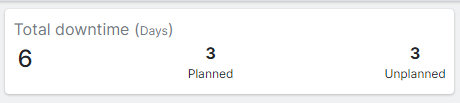
Figure 4: Total Downtime in Failure History
¶ Mean Time To Repair (MTTR)
This section provides the average time, measured in days, required to repair the unit following a failure.
Mean Time To Repair (MTTR) is a key performance indicator that measures the average time required to diagnose, repair, and restore a failed unit to full operational status. It is an essential metric for assessing the efficiency and effectiveness of maintenance processes.
Importance
-
Maintenance Efficiency: Provides insights into the efficiency of repair processes and maintenance teams.
-
Operational Reliability: Helps in evaluating the reliability of power plant operations by tracking how quickly units can be returned to service after a failure.
-
Cost Management: Shorter MTTR can lead to reduced downtime costs and improved resource allocation.
Calculation
MTTR is calculated using the following formula:
MTTR = Total Downtime/Number of Failures
-
Total Downtime: The sum of all the time periods taken to repair each failure.
-
Number of Failures: The total number of repairable failures that occurred within the specified period.
For example, if a power plant unit experienced 5 failures in a month, and the total downtime for these repairs was 10 days, the MTTR would be:
MTTR = 10 days/5 failures = 2 days per failure
This indicates that, on average, it takes 2 days to repair a unit and return it to operational status after a failure. Consistently tracking and analyzing MTTR can help power plants improve their maintenance strategies, reduce downtime, and enhance overall operational efficiency.
MTTR is a crucial metric for evaluating the effectiveness of maintenance practices in power plants. By understanding and optimizing MTTR, power plant operators can enhance reliability, minimize downtime, and ensure more efficient operations.

Figure 5: Mean Time to Repair
¶ Asset Uptime Percentage
Asset Uptime Percentage is a performance metric that measures the proportion of time a power plant unit or asset is operational and available for use compared to the total available time over a specified period.
Asset Uptime %: The percentage of time the unit was up and running compared to the total available time. High uptime indicates reliability and effective maintenance practices, while lower uptime may highlight areas needing improvement.
Example
- Asset Uptime Percentage: 98%
This indicates that the unit was operational and available for use 98% of the time during the specified period, reflecting high reliability and effective maintenance practices.

Figure 6: Asset Uptime
¶ Failures Section: Detailed Failure Information
This section showcases detailed information about each failure event in a tabular format,
In the top right corner of this section, there is a "Report Failure" button. Follow these steps to report a failure:
-
Click "Report Failure":
-
Located at the top right corner of the Failures Section.
-
On clicking, a new window titled "Report a Shutdown" will pop up.
-
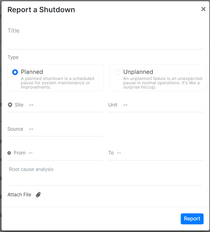
Figure 7: Report a Shutdown
-
Enter Details:
-
Title: Enter the title of the report. This field is mandatory; if left blank, a message will prompt to enter the report name.
-
Type: Select whether the shutdown is planned or unplanned.
-
Site and Unit Information: Select the site, unit, system, system instance, and equipment details in sequence, ensuring the dropdown menus display information in the appropriate order.
-
From (Shutdown Period): Specify the start and end dates of the shutdown period. This field is also mandatory
-
Root Cause Analysis: Provide the root cause analysis.
-
-
Attach Files: Click "Attach a File" to upload any related documents (e.g., PDF, DOC, Excel).
-
Submit: Click the blue "Report" button to submit the report.
-
Click on the cross 'x' button on top to close this window.
This process ensures all relevant information is captured and documented for review as depicted in the list view. In the Failures Section, the following information is captured and displayed in a tabular format for each reported failure:
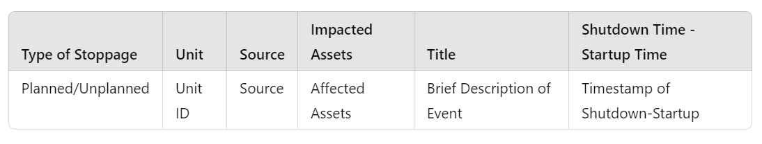
Figure 8: Tabular Format for reported Failure
-
Type of Stoppage: Indicates whether the stoppage was planned or unplanned.
-
Unit: Identifies the specific unit that experienced the stoppage.
-
Source: Specifies the origin of the stoppage, such as name of equipment. eg Boiler
-
Impacted Assets: Lists the assets that were affected by the stoppage. eg Afbc
-
Title: Provides a concise title or description of the event.
-
Shutdown Time - Startup Time: Records the time span from when the unit was shut down to when it was restarted.
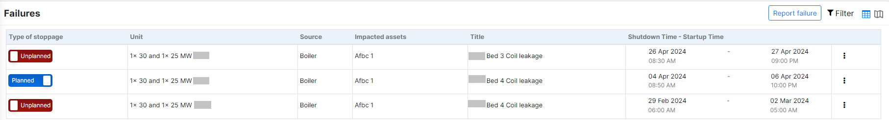
Figure 9: Failures detailed view
Planned and unplanned buttons can be toggled under the "Type of Stoppages" row. Clicking the "Planned" button changes its type to "Unplanned." Hovering over the button displays an option to "Mark as Unplanned," allowing for easy toggling with a click.
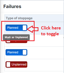
Figure 10: Types of stoppages from Failures page
Click on the 3 dots in front of a failure to Edit or delete that report as shown below.
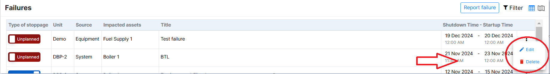
Figure 11: Edit or Delete option
Clicking on "Edit" opens a "Report a Shutdown" window, allowing the user to modify any necessary information. Clicking on "Delete" will remove that specific shutdown report.
There is a filter button on the right corner in the Failures section. Click on it and the user can filter any unit , source, stoppages or Assets.
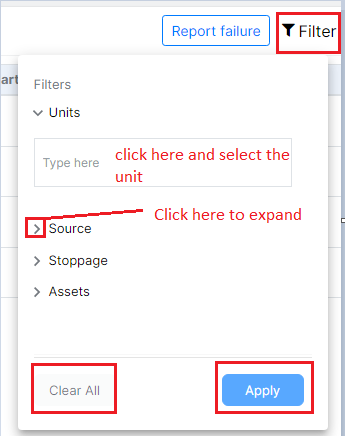
Figure 12: Filter options
Click on "Apply" once all options are filtered according to the user.
Users have the option to switch the view for analyzing reports in the Failures section by clicking on the "Change View" button located at the top right corner. From there, they can select the Excel View. Refer to the image below to see how to switch views.

Figure 13: Excel View option by clicking on the change view button
This view helps users prioritize which equipment issues need immediate attention based on the frequency and pattern of the failures. Equipment that usually operates without issues but starts showing frequent problems is more concerning and requires swift action to prevent potential failures.
Here's a summary and breakdown of the explanation of a detailed overview of how to interpret the "Failures Excel" view and what the data signifies :
-
Purpose of the View:
- The view displays the details of the equipment and the number of times each piece of equipment indicated an issue within a month and over a year.
-
Colored Values:
-
The colored values in the cells represent the failure of that equipment on the corresponding date.
-
If a block has a value, it means there was a failure for that equipment on that date.
-
Blocks without values indicate that the equipment did not fail during that time period.
-
The cells are color-coded with varying shades of red.
-
Darker shades indicate higher frequencies of the deviation or incident, while lighter shades indicate lower frequencies.
-
-
Understanding Equipment Issues:
-
If equipment shows a high number of issues throughout the year, it means that equipment frequently has problems. Therefore, if it also shows issues in a given month, it might not be a high priority because it is consistently problematic.
-
Conversely, if equipment generally does not show issues throughout the year but suddenly shows a high number of issues in a particular month, this indicates a significant problem that needs to be addressed promptly. This type of anomaly is more critical because it deviates from the normal performance of the equipment.
-
-
Prioritizing Failures:
-
Equipment with persistent issues over the year may indicate chronic problems but not necessarily urgent ones.
-
Equipment with sudden spikes in issues within a month, despite usually being reliable, indicates an urgent issue that could lead to failure if not addressed.
-
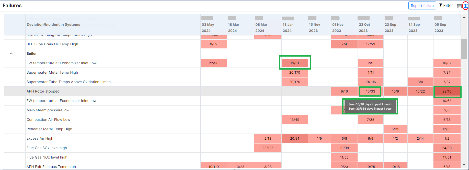
Figure 14: Calendar view of failures
The image shows a table listing various deviations or incidents in systems over several dates. Here's a breakdown of what is displayed:
-
Columns:
-
The leftmost column lists different types of deviations or incidents related to a system, such as "APH Rotor Stopped,"FW temperature at Economizer Inlet Low," "Superheater Metal Temp High," etc.
-
The subsequent columns represent specific dates ranging from "05 Sep 2023" to "03 May 2024."
-
-
Cells:
-
Each cell under the dates contains data representing the occurrence and frequency of the deviations or incidents.
-
The format within the cells is typically a ratio such as "15/98" or "10/67."
A - The numerator (e.g., 15 in "15/98") likely represents the number of days the specific incident was observed in a month. The numerator tells the number of times an incident was observed during failure time
B - The denominator (e.g., 98 in "15/98") likely represents the total number of days a specific incident was monitored over a year. The denominator tells the number of times an incident was observed during non-failure time
-
-
Tooltip Information:
-
When hovering over a cell, a tooltip appears showing more detailed statistics:
-
"Seen 10/30 days in the past 1 month" suggests that the deviation was observed on 10 days out of the past 30 days.
-
"Seen 33/335 days in the past 1 year" indicates that the deviation occurred on 33 days out of the past 335 days.
-
-
The highlighted parts in green on the image focus on specific cells that provide information on the frequency of certain deviations or incidents within a month and over a year. Let's break down each of these highlighted sections:
Highlight 1: "19/31" for Superheater Metal Temp High
-
Location: This cell is under the column for "13 Jan 2024" and the row for "Superheater Metal Temp High."
-
Meaning:
-
19/31: This indicates that the "Superheater Metal Temp High" issue was observed for 19 days in the past 1 month.
-
31 indicates that the issue was observed 31 times in the past 1 year.
-
This is a relatively high frequency, suggesting that this particular issue was quite persistent throughout the month of January 2024 and needs to be considered.
-
Highlight 2: "10/33" for APH Rotor stopped
-
Location: This cell is under the column for "01 Nov 2023" and the row for "APH Rotor stopped."
-
Tooltip Information: Hovering over this cell reveals a tooltip that provides additional context:
-
Seen 10/30 days in the past 1 month: This means that the "APH Rotor stopped" issue was observed for 10 days out of the last 30 days leading up to November 2023.
-
Seen 33/335 days in the past 1 year: This means that the "APH Rotor stopped" issue was observed for 33 days out of the 335 days in the past year.
-
Highlight 3: "22/10" for APH Rotor stopped
Location:
- This cell is under the column for the respective date and the row for "APH Rotor stopped."
Meaning:
-
22/10:
-
22: Indicates that the "APH Rotor stopped" issue was observed 22 times in the past 1 month.
-
10: Indicates that the issue was observed 10 times in the past 1 year.
-
The dark color itself indicates the criticality of failure.
-
Interpretation:
- The "APH Rotor stopped" issue has a higher frequency of occurrence in the past month (22 times) compared to the entire past year (10 times). This suggests that this particular issue has recently become more persistent, and it needs immediate attention and investigation to understand the cause of this sudden increase in occurrences.
In summary, the "22/10" highlights that the "APH Rotor stopped" issue has seen a significant rise in frequency over the last month, which is unusual given its lower yearly frequency. This could indicate a developing problem that requires urgent maintenance or review. So, the table provides a visual representation of the frequency and distribution of various system deviations or incidents over time, using numerical data and color coding for easier interpretation.