¶ Dashboard of Pulse
The Pulse dashboard provides a comprehensive and customizable interface for monitoring the selected unit's operational status, key metrics, and asset performance. Integrating graphical displays with detailed data empowers users to effectively oversee and manage efficiency, safety, and overall performance. Designed to support operators, the dashboard delivers real-time insights and actionable recommendations, ensuring optimal system functionality, improved safety, and minimized downtime.
Pulse's dashboarding tool provides a flexible platform for creating tailored dashboards that visualize sensor data for each plant. Users can create and save multiple dashboards, each catering to the needs of different sections or teams within the plant, enabling a quick overview of plant operations. Supported chart types include:
Gauge
Histogram
Line
Scatter
Table
Hybrid
Bar chart
Text
Notes
AB Text
Table
Snapshot
The dashboard also provides a user-configurable display of key performance indicators (KPIs) specific to the unit and its associated equipment.
The top row of the dashboard page includes the following dropdown menus:
Customer name
Site or location name
Unit name
Status of connection (online/offline)
Last updated date

Figure 1. Dashboard- Ops center header
The left side of the dashboard features visualizations related to tags and KPIs, offering real-time data and insights. On the right side, actionable recommendations are displayed to guide users in making timely and informed decisions. This centralized and intuitive layout facilitates a clear understanding of assets and ensures seamless monitoring and management from a single interface.
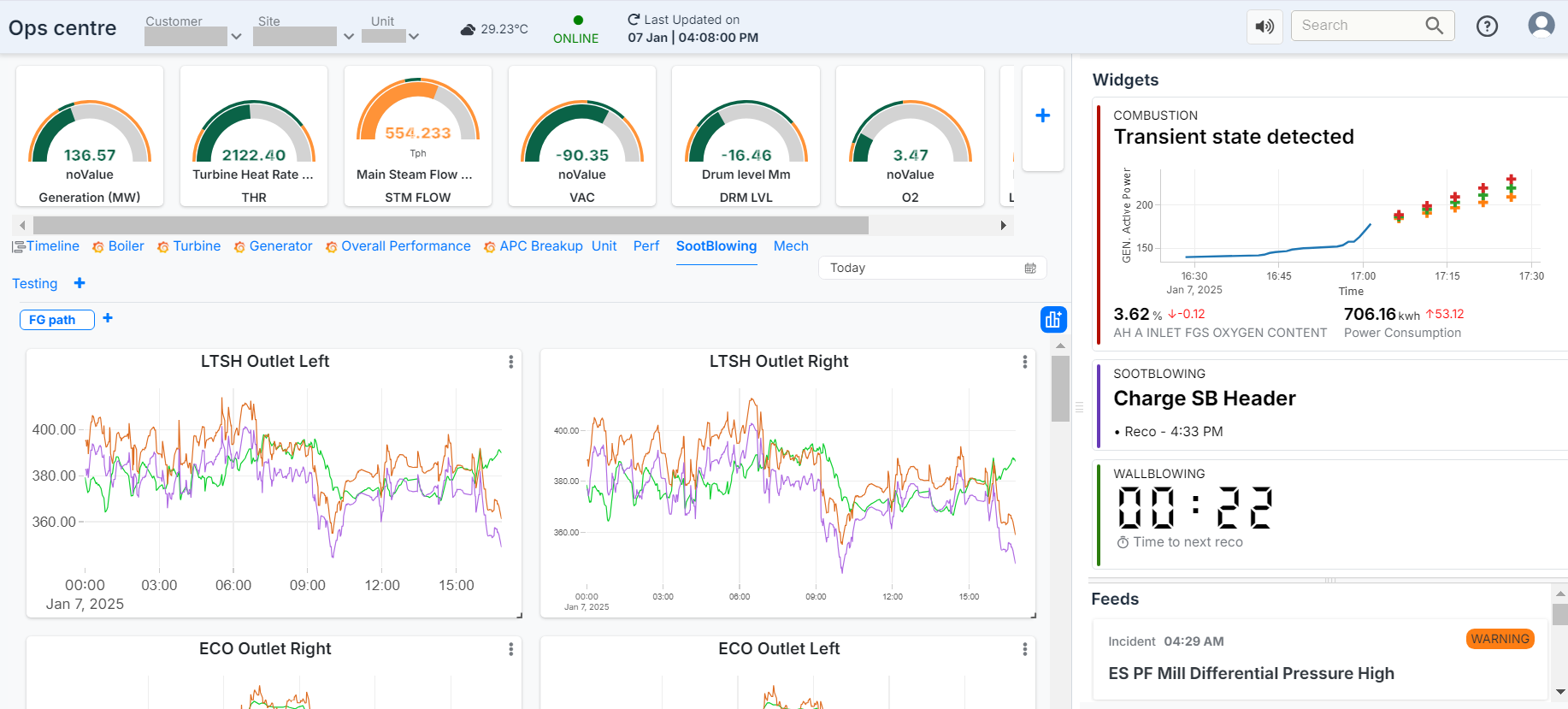
Figure 2. Dashboard Page
When a transient state is detected, an alert window automatically pops up on the screen, triggered by changes in the live data state. This alert is not initiated by user interaction but occurs whenever a state change is identified.
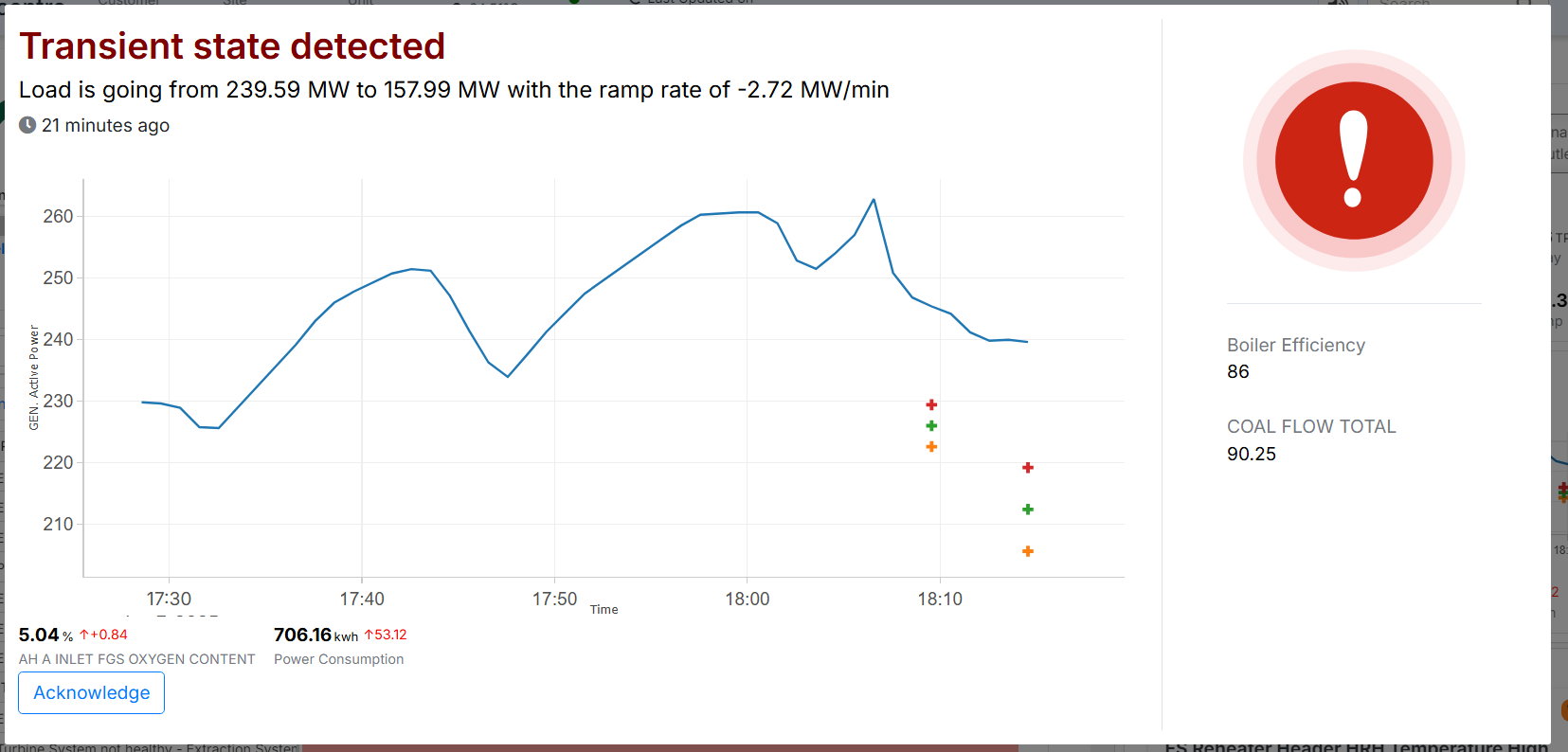
Figure 3. Transient state detected
The top-left section of the dashboard features a gauge view that highlights whether tags are within their defined threshold limits. The gauge consists of inner and outer color indicators:
The inner color represents the current value of the tag, turning green for the values that fall within the threshold range and orange if it falls outside.
The outer color ring represents the threshold range, where the portion within the user-defined limits appears green, and the rest appears orange.
The gauge also displays the current live value of the tag prominently for real-time monitoring.
Additionally, there is a "+" button beside the gauge. Clicking this button allows the user to add a new tag and choose its representation as a gauge or bar, based on their preference.
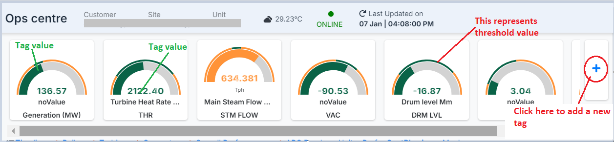
Figure 4- Top - Left view of Dashboard page
¶ Adding a New Tag
When the user clicks the "+" button, a new window appears, allowing them to add a new tag with all the necessary details. Here's how the process works:
Tag Selection (Left Side)
The left side of the window displays the Tag section.
Users can type in the desired tag name, and a list of matching tags will appear.
The user selects the appropriate tag from this list.
Details Input
After selecting the tag, the user must enter the following details:
Measurement Unit: Specify the unit for the tag.
Label Value: Provide a label to identify the tag.
Design Value: Define the reference or baseline value for the tag.
Adding a New Transformation
Click on the "New Transform" button.
A dialog box appears under the Transform section.
The dialog includes a dropdown menu or filter options to select the type of transformation. The available options include:
Minimum
Maximum
Percent Comparison to Threshold Value
Sampling Frequency
The user can set the sampling frequency for the selected transformation. Available options include:
Milliseconds
Minutes
Hours
Days
Months
Once all the details are entered and the desired transformations and sampling frequencies are configured, the user can save the tag for it to be added to the dashboard.
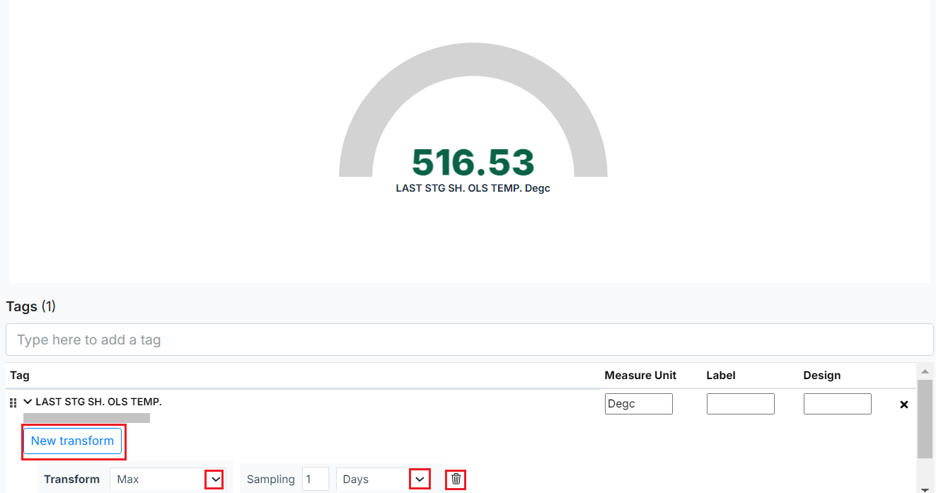
Figure 5. Adding a New Tag
Configuring the Right-Side Options for Dashboard Display
The right side of the window allows the user to customize how the selected tag will be displayed on the dashboard. Below are the configuration options available:
Representation Type
A drop-down menu provides two options for displaying the tag:
Gauge: Displays a visual, graph-like representation.
Text: Displays only textual information for the tag.
Panel Options
Title: Users can enter the title that will be displayed for the tag on the dashboard.
Font Size: The font size is customizable, allowing users to adjust it based on their requirements.
Threshold Configuration
Selecting the Threshold button provides three options:
Prediction: Displays the predicted value along with the Lim High and Lim Low ranges on the gauge for the tag.
Limit: Enables the user to define the limit range by clicking the small "+" button below the limit section. Users can also customize the color for this limit range by clicking on the color option.
Design: Indicates the baseline or reference value for the tag.
Standard Value
Users can add a decimal value and associate a tag to compare its values against the entered tag.
The detailed view for the standard value can be configured as:
Default
Customizable
Relative
Absolute
Aggregator Configuration
Users can choose an aggregation operation to apply to the tag.
Common aggregation options include:
Sum
Min (Minimum)
Max (Maximum)
Count
Avg (Average)
Last (Most recent value)
Users can also select specific fields to perform the desired aggregation operations.
Once all configurations are complete, the user can save the settings to display the tag on the dashboard with the chosen visualization, formatting, and aggregation options
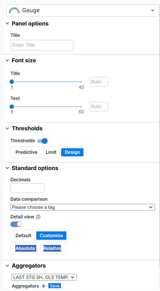
Figure 6- Add display features for tag
- After entering all the required details, click the "Save" or "Discard" button located at the top-right corner of the screen, based on your requirements.
In the next section below this gauge view of the dashboard, there are additional sections for reference:
¶ Timeline
This section displays a list of incidents and deviations based on the date range selected in the filter. Selecting an incident will reveal the associated tags and their details for the specified time period on the right side of the block. Similarly, clicking on deviations will show the corresponding tags and their deviations for the selected time frame on the right panel.
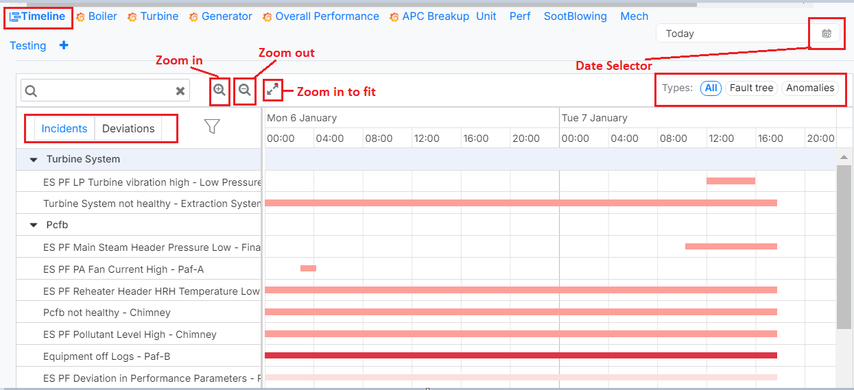
Figure 7. Timeline section of the Dashboard
¶ Dashboard Overview-
The Pulse Dashboard offers a unified view of essential boiler performance parameters, enabling real-time monitoring, enhancing operational efficiency, and ensuring adherence to safety and environmental standards. By combining graphical and numerical data, it equips plant operators with actionable insights to maintain optimal boiler performance and streamline maintenance activities. Below is a detailed overview of the Boiler dashboard.
Note: "Boiler" is the current name of the dashboard implemented using Grafana, though its name may vary across different units.
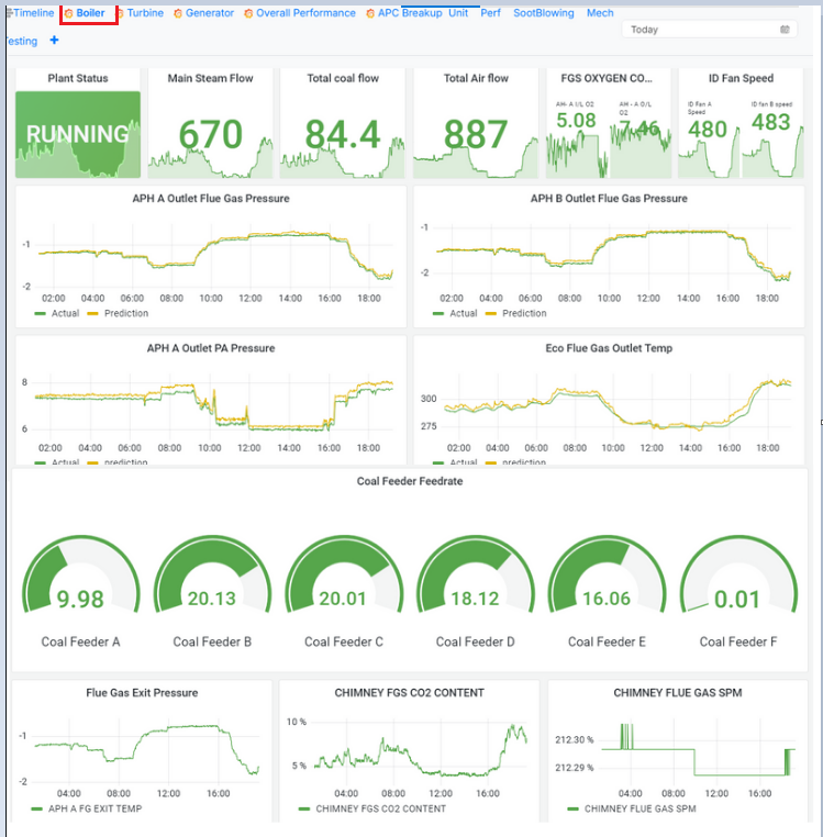
Figure 8. Dashboard- Boiler performance
- Key Features and Metrics Displayed
Plant Status
Graphical Status Display: The boiler's real-time operational state, such as "Running," is prominently shown, accompanied by a dynamic graph representing live data trends.
Purpose: Enables operators to assess the health and functioning of the plant quickly.
Main Steam Flow
Metric: Displays the live flow rate of steam generated by the boiler (e.g., tons/hour).
Graph: Includes a trend graph showing the variations over time.
Significance: Helps monitor the boiler's steam generation capacity and detect deviations from optimal levels.
Total Coal Flow
Metric: Represents the cumulative feed rate of coal supplied to the boiler.
Purpose: Ensures sufficient fuel supply for efficient combustion and identifies anomalies in coal feeding systems.
Total Air Flow
Metric: Displays the total volume of air supplied for combustion.
Significance: A key parameter for maintaining the air-fuel ratio and combustion efficiency.
FGS Oxygen Content
Metric: Tracks the oxygen concentration in the flue gases.
Graph: Provides a time-series representation of oxygen content.
Importance: Indicates combustion efficiency and helps optimize the air-fuel ratio.
ID Fan Speed
Metric: Shows the speed of the induced draft (ID) fans responsible for extracting flue gases from the boiler.
Graph: Trend analysis helps monitor system health and maintain steady gas flow.
APH (Air Preheater) Outlet Parameters
Metrics: Includes graphs for outlet flue gas pressure, PA (Primary Air) pressure, and flue gas temperature.
Graph Details: Compares actual values with predictive analytics.
Relevance: Identifies inefficiencies or blockages in air and gas flows.
-> Additional Metrics for Comprehensive Monitoring
Coal Feeder Feedrate
Dial Gauges: Real-time feed rates for each coal feeder (A through F) are displayed in individual gauges.
Significance: Ensures balanced coal feeding to achieve uniform combustion.
Use Case: Variations across feeders can indicate issues with the coal feeding mechanism, requiring timely intervention.
Flue Gas Exit Pressure
Graph: Displays the pressure of flue gases exiting the boiler.
Purpose: Prevents flow blockages and ensures smooth operation of the exhaust system.
Chimney FGS CO2 Content
Graph: Tracks the concentration of CO2 in flue gases.
Importance: A key indicator of combustion quality, enabling operators to optimize the air-fuel mixture.
Chimney Flue Gas SPM (Suspended Particulate Matter)
Graph: Represents particulate levels in the chimney's flue gas emissions.
Significance: Monitors environmental compliance and highlights the performance of emission control systems like electrostatic precipitators or bag filters.
Note- Similar to the features and graphs displayed for boilers, the dashboard also provides graphs and metrics for the turbine, generator, overall performance, and APC, ensuring a holistic view of the operational parameters across all critical systems.
¶ Widgets Section
The top right section of the dashboard displays real-time recommendations and insights based on live operational data. Each widget corresponds to a specific operational aspect, providing key performance indicators (KPIs) and their status.
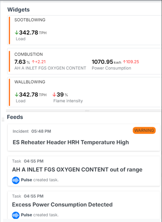
Figure 9. Widgets and Feeds of Dashboard
Color Coding of Recommendations:
Orange Highlight: Indicates a critical recommendation that requires immediate action to prevent potential issues.
Green Highlight: Suggests that the system is operating normally, and no immediate action is needed.
Purple Highlight: Represents a non-urgent recommendation that can be addressed at a later stage.
Details Displayed:
Sootblowing: Shows the current load in tons per hour (TPH).
Combustion:
Displays the percentage of oxygen content at the Air Heater (AH) inlet.
Highlights power consumption in kilowatt-hours (kWh), including any deviation from the baseline.
Wallblowing:
- Indicates the current load and the percentage drop in flame intensity.
¶ Feeds Section
The bottom right section of the dashboard provides a log of incidents and tasks generated for the selected unit on the current date.
Incident Log:
Each entry is timestamped and categorized as an Incident or a Task.
Urgent incidents, such as high temperatures or critical parameter deviations, are marked with a warning icon and highlighted in orange for quick attention.
Examples:
Incident (5:48 PM): A critical warning regarding the high temperature of the ES Reheater Header HRH, requiring immediate action.
Tasks (4:55 PM):
The oxygen content at the AH inlet is out of range.
Excess power consumption is detected, prompting the user to investigate and address the issue.
¶ Benefits of the Boiler Timeline Dashboard
Real-Time Monitoring: Provides live data and predictive insights for proactive decision-making.
Operational Efficiency: Ensures optimal fuel usage, air-fuel ratios, and combustion quality.
Safety and Reliability: Detects anomalies in key parameters to prevent potential equipment failures.
Environmental Compliance: Tracks emissions data to ensure adherence to regulatory standards.
User-Friendly Visuals: Combines dials, trend graphs, and bar charts for intuitive data interpretation.
¶ Configuration and Customization
Admin Access: Only users with admin credentials for Grafana can configure and add dashboards.
Customization: The dashboard allows flexible configurations tailored to plant-specific needs and operational goals.
Support: For assistance with dashboard configuration, contact the ExactSpace team.
¶ Troubleshooting Dashboard Issues
The following are the steps to resolve some of the issues an Admin user might face when configuring a Dashboard:
Issue: Grafana doesn't load.
Solution: Connect with the ExactSpace team.
Issue: Authentication or Sign-In issue because of cookies
Solution: Empty cache, delete cookies, and refresh the page
Issue: No data because of Scylla or Kairos issue.
Solution: Connect with the ExactSpace team.
Issue: No calculated values loading because data might not be
present for a particular calculation.
Solution: Restart Stack - Click only once.
Stack restarting operation takes about 20 minutes to complete. Then reload the dashboard.