¶ Dashboard - BPCL users
¶ 1.1 Pulse Application Workflow for Dashboard
The workflow diagram outlines the navigation process within the Dashboard module of Pulse. It depicts how a user, upon entering the Dashboard, can explore various sections by following the defined sequence of clicks. Each step in the flow indicates the page or view that opens next, enabling users to seamlessly move between summary views, detailed analytics, and specific asset or KPI dashboards. The diagram also reflects how different navigation paths within the module are interconnected, ensuring users can quickly access the required information with minimal steps.
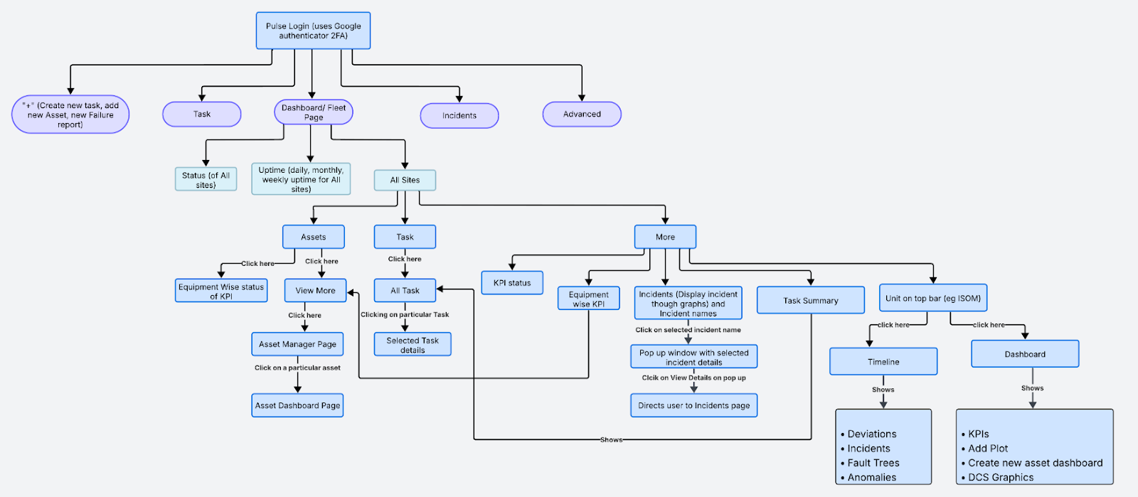
Figure 1. Pulse Application Workflow- BPCL
¶ 1.2 Application Entry Point – Dashboard Page
Upon successful login, the system redirects the users to the Dashboard page. The Dashboard gives a real-time summary of site operations across all BPCL units.
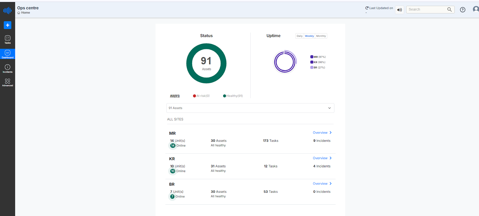
Figure 2. Dashboard- landing Page
¶ 1.3 Overview of Dashboard Features
- Status Donut for Asset Health: Displays the total number of assets and the percentage of healthy versus at-risk assets. In the above image, the total number of Assets is 91, where Healthy ones are represented in green and Unhealthy ones are currently 0 (at risk), represented in red color.
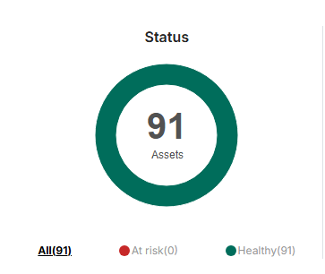
Figure 3. Asset Status Indicator
- Uptime Graph: This section provides a visual representation of the uptime percentage across different BPCL sites. Users can toggle between daily, weekly, or monthly views to monitor performance over different time frames. In the example shown below, the Weekly uptime view is selected in the below reference image. The graph displays the following data for three units:
- MR: 97% uptime
- KR: 99% uptime
- BR: 96% uptime
This visual representation helps BPCL teams quickly assess operational reliability across locations and identify any sites that may require attention.
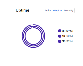
Figure 4. Asset Uptime Indicator
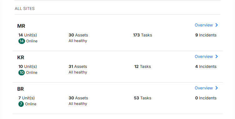
- Site Listing: For each site (e.g., MR, KR, and BR ), the dashboard shows:
5. Sites List
Number of Units Online:
This section provides the current operational status of all units. Units marked with a green circle are online and running. As shown in the image, MR has 14 units (all online), KR has 10 units (all online), and BR has 7 units (all online).
Number of Assets:
- MR has a total of 30 assets, all healthy.
- KR has a total of 31 assets, all healthy.
- BR has a total of 30 assets, all healthy.
Tasks Associated with Each Site:
- MR has 173 tasks.
- KR has 12 tasks.
- BR has 53 tasks.
Current Incidents for Each Site:
- MR has 9 incidents.
- KR has 4 incidents.
- BR has 0 incidents.
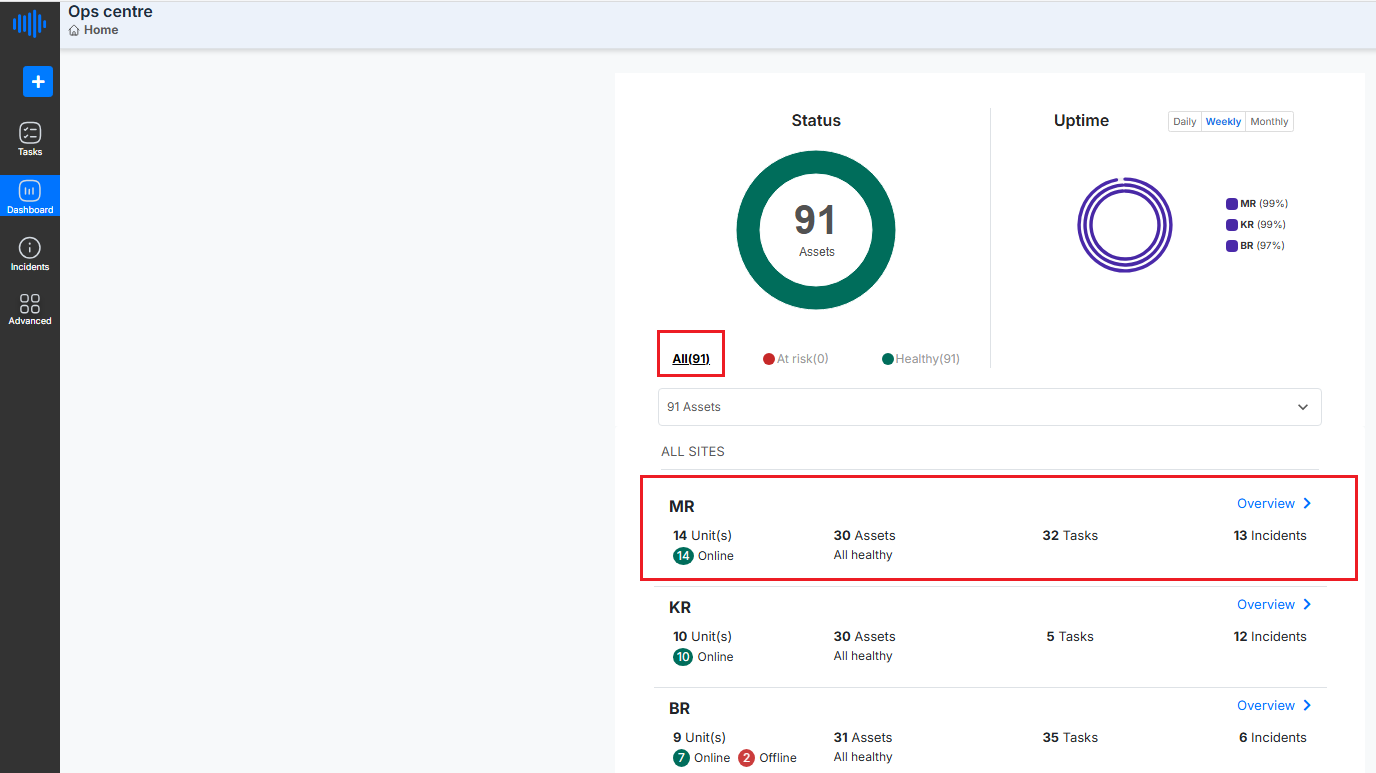
Figure 6. List of sites filtered by ‘All’
From the Dashboard/Fleet landing page, users can navigate directly to Assets, Tasks, or Incidents by clicking on the respective buttons listed under the number of assets for that unit section.
- To access the Assets page for a specific site, click on the "No. of assets" link displayed next to the site name (e.g., 30 Assets as shown in the image below).
This expands the section to display the Unit-wise status of KPIs for that site.
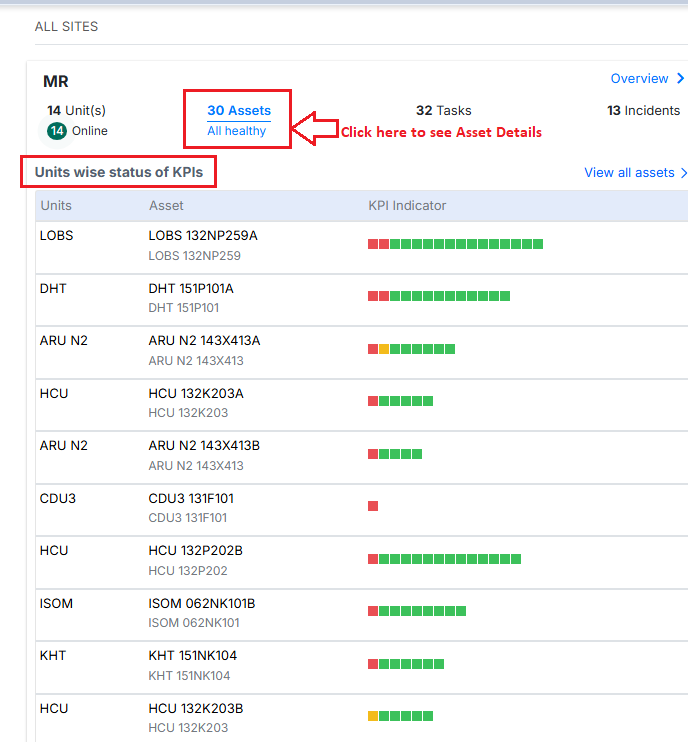
Figure 7. Equipment-wise KPI status from the Dashboard page
Asset Matrix Display Logic in Unit-wise status of KPI
The "Unit-wise Status of KPIs" section displays a list of units, their associated assets, and the corresponding KPI indicators. While this list may appear like a simple overview, it is not displayed in a random order.
Instead, the arrangement of units and assets in this section follows a well-defined sorting logic based on the severity and distribution of incidents linked to each asset. This ensures that assets with the most critical or widespread issues are highlighted at the top, allowing teams to prioritize attention and response.
Each asset is represented using colored fault tree indicators, where:
- Red indicates a critical issue,
- Orange indicates a warning,
- Yellow indicates a deviation, and
- Green means no current incident.
Assets with more severe (red/orange) or widespread issues are automatically positioned higher in the list. This ensures that teams can easily identify and prioritize the assets needing the most urgent attention.
The sorting criteria used for this visualization are explained in detail below.
Sorting Criteria
1. Incident Severity-Based Sorting
Each asset can have multiple fault trees, and each fault tree can have one active/open incident at a time. Each incident has a severity level:
- Critical (Red) = 3
- Warning (Orange) = 2
- Deviation (Yellow) = 1
- No Incident (Green) = 0
The sorting prioritizes assets with the highest severity incidents at the top:
- Assets with critical (red) incidents come first.
- Followed by those with warning (orange) incidents.
- Then the deviation (yellow) incidents.
- Finally, assets with no open incidents (green only) are listed at the bottom.
Example:
Let’s consider two assets — Asset A and Asset B.
- Asset A has 3 fault trees, and all 3 are showing critical-level issues (Red).
- Asset B has 4 fault trees, where 3 are critical (Red) and 1 is slightly less severe (Orange).
Even though both have critical issues, Asset B is placed above Asset A in the list.
Why?
Because Asset B has more fault trees affected, it means the issue is more widespread and may require quicker attention.
Note- Assets with more severe and widespread issues are shown at the top of the list, helping teams focus first on the most urgent problems.
2. Number of Fault Trees with Incidents
If two or more assets have the same maximum severity level, then the one with more fault trees having open incidents will appear higher.
3. Green-Only Assets Sorting
If there are assets with no open incidents (i.e., all fault trees are green):
- These assets are sorted based on the total number of fault trees.
- The asset with more fault trees appears higher in the list.
Visual Interpretation on UI
The screenshot shows how this logic is applied on the UI:
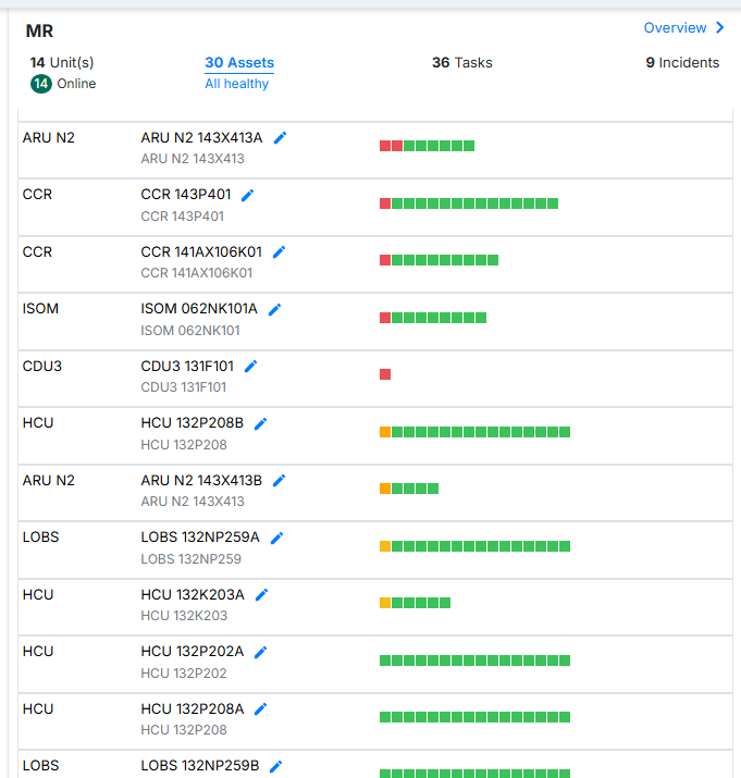
Figure 8. List of Assets
- Red blocks indicate critical severity – these units/assets appear at the top.
- Orange blocks indicate warnings – sorted below red.
- Yellow blocks for deviations come next.
- Assets with only green blocks are sorted toward the bottom, depending on the number of fault trees.
This sorting helps operators and reliability engineers prioritize attention toward the most critical assets quickly and efficiently.
How to reach the Task summary dropdown from the dashboard page
- To access the Tasks Summary dropdown for a specific site, click on the "No. of tasks" link displayed next to the site name on the dashboard landing page.
This expands the section to display the status and breakdown of tasks for that site.

Figure 9. Tasks Tab on Dashboard
- To access the Incidents Summary for a specific site, click on the "No. of incidents" link displayed next to the site name on the Dashboard/Fleet landing page.
This expands the section to display incident trend graphs and a summary of incidents for that site or unit.
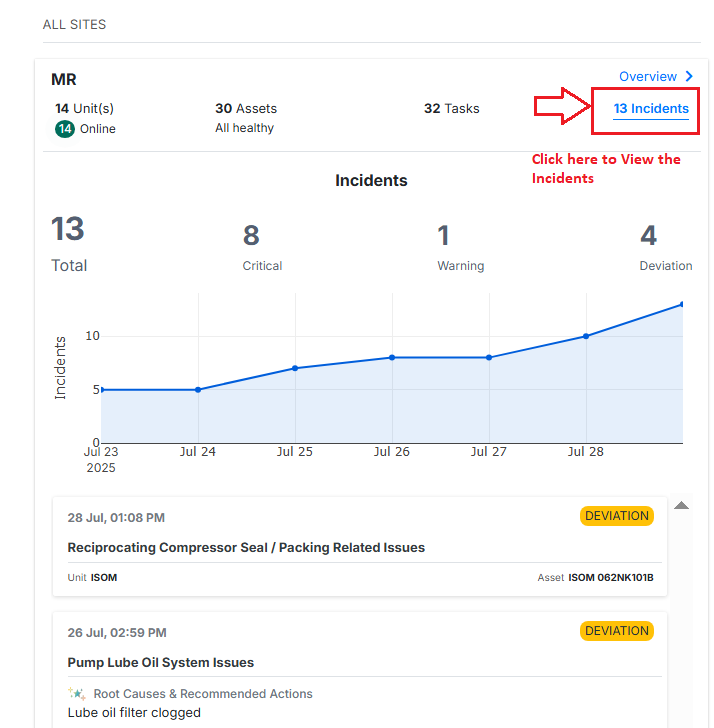
Figure 10. Incident summary from the Dashboard page
Clicking on the “Overview” opens a new window that provides detailed information about the selected site. This includes specific metrics, performance trends, historical data, and other key parameters related to that unit’s operation.
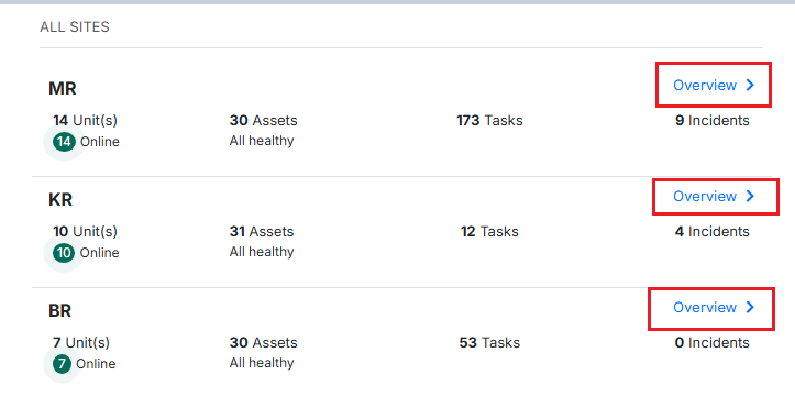
Figure 11. Overview Button On the List of Sites
This view helps users analyze unit-level performance in-depth and take informed actions based on the available insights.
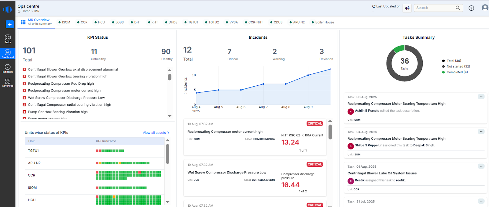
Figure 12. Ops Centre- Home page
¶ 1.3.1 Unit Details Page Overview
Upon selecting "Overview" for the MR Unit on the Ops Centre dashboard, users are redirected to a detailed site-level view. This page provides a comprehensive overview of the operational status, key performance indicators (KPIs), incident summary, and task assignments specific to the MR unit. It enables users to monitor the unit’s health, identify problem areas, and take appropriate action based on real-time data.
Unit Navigation Bar
The top bar displays a list of all units under BPCL/site. The selected site is highlighted for easy reference—in this case, MR is selected, as indicated by the breadcrumb path Fleet / MR.
Users can switch between units (such as ISOM, CCR, HCU, etc.) by simply clicking on the respective unit name to access its specific operational data and insights.

Figure 13. Ops Centre (unit name)
¶ 1.3.2 KPI Status Panel (Left Side)
- Total Fault Templates Deployed: 101
- Healthy Fault Trees: 92 (shown in green color in the list below)
- Unhealthy Fault Trees: 9 (shown in red in the list below)
A list of active (critical/ warning /deviation) alerts is shown in this section, where each entry specifies the issue and the associated equipment. Critical alerts are prioritized at the top of the list and are highlighted in red, indicating it's a high-priority concern. Alerts indicating healthy or normal conditions appear below, marked in green for quick visual distinction.
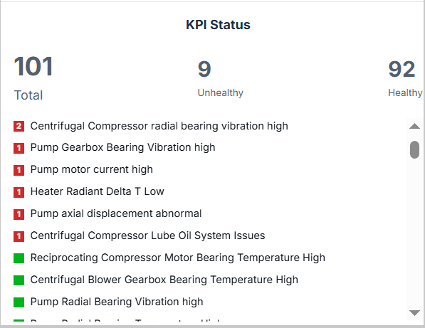
Figure 14. KPI status
Color Code:
- Red = Unhealthy KPI
- Green = Healthy KPI
¶ 1.3.3 Equipment-wise KPI Status
Located below the KPI list, this table offers a visual matrix of unit-level health:
- Each unit (e.g., DHT, HCU, CCR, and more) is represented row-wise.
- A grid of red and green boxes shows the condition of each KPI indicator:
- Green Box = KPI is within acceptable limits.
- Red Box = KPI has deviated and needs attention.
This granular, small box with colors helps users quickly identify which units require inspection or action. Refer to the figure below.
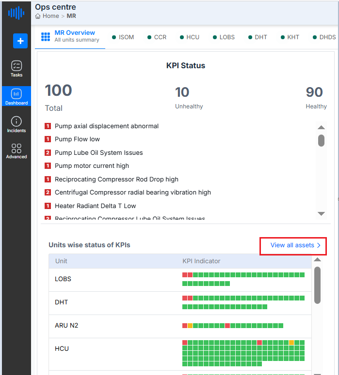
Figure 15. Equipment-wise KPIs
The “View all assets” option redirects the user to the Asset Manager Page
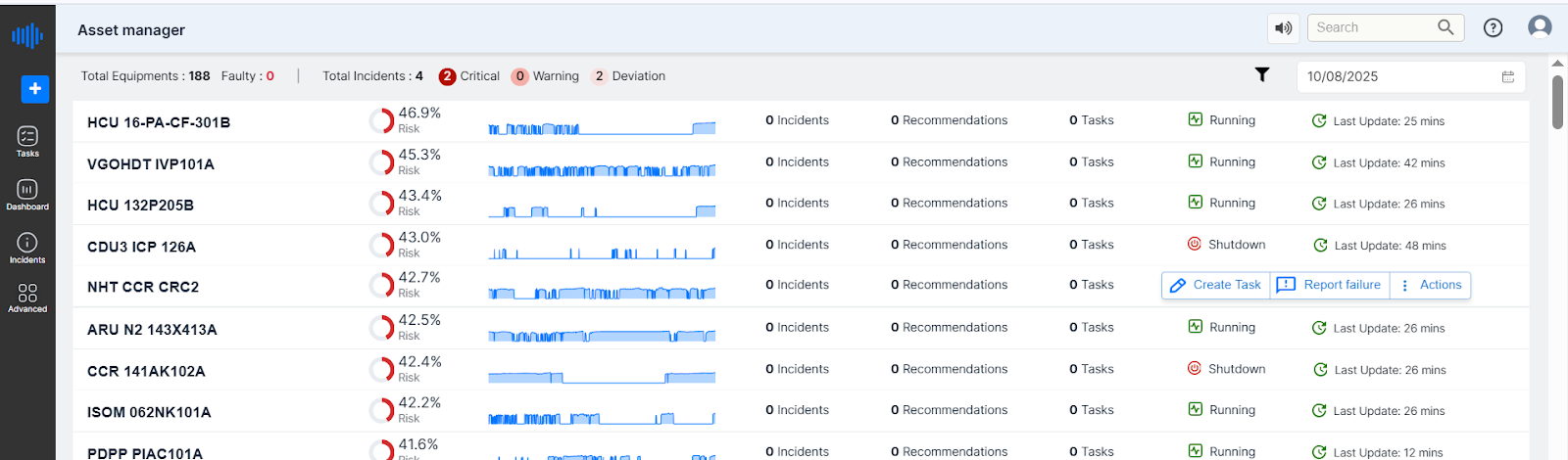
Figure 16. Asset Manager Page
Asset Manager Page Overview
When the user clicks on the “View All Assets” option, they are redirected to the Asset Manager page. This page provides a centralized view of all monitored assets along with their operational status, health indicators, and other key metrics.
For more details on Asset manager page Refer to section 13 of this document.
¶ 1.3.4 Incidents Chart (Center)
This chart shows the trend of incidents reported within the selected unit over a defined period (August 4 to August 10) Refer to the figure below.
- Total Incidents: 10
- Critical: 5
- Warnings: 2
- Deviation: 3
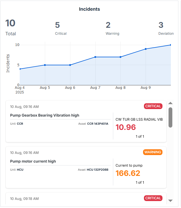
Figure 17. Incidents List on Dashboard
The line chart visually depicts the increase in critical incidents over time, with the data points rising steadily towards Aug 10, 2025.
A card view below the graph shows individual incident logs, along with timestamps and severity tags (e.g., CRITICAL in red):
- Example:
- 09:16 am – Pump Gearbox Bearing vibration is high
Incidents
The Incidents module is where operational abnormalities or issues from field systems are recorded and raised as alarms (incidents).
Purpose of Incident Tracking
Incidents serve as the early warning system for BPCL’s operations. They may include:
- Alarms from sensors (e.g., high pressure, temperature spike).
- Field observations (e.g., leak detected, abnormal noise).
- System-generated events based on thresholds.
These are not just alerts but entries that can be investigated through tasks and tracked to closure.
Clicking on a specific tag opens a new window displaying detailed information related to that incident.
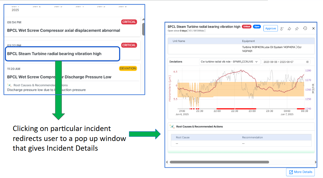
Figure 18. Incidents and their details
For example, in the above image, selecting "BPCL Steam Turbine radial bearing vibration High" opens a pop-up window of the incident, including a graphical representation of parameter values and other relevant details
Users can view additional information about the incident by clicking on the “More Details” option located at the bottom-right corner of the pop-up window, as shown in the image below.
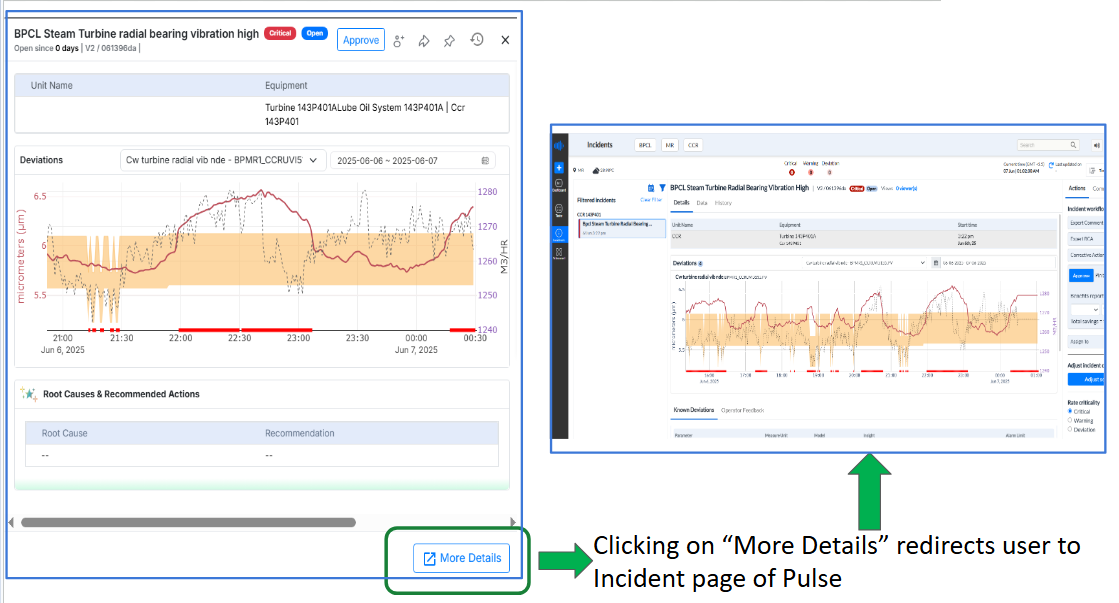
Figure 19. Figure Explaining How to* See Details *of Incidents
This action redirects the user to the Incidents Page of Pulse, where a comprehensive view of the selected incident is available, as shown below.
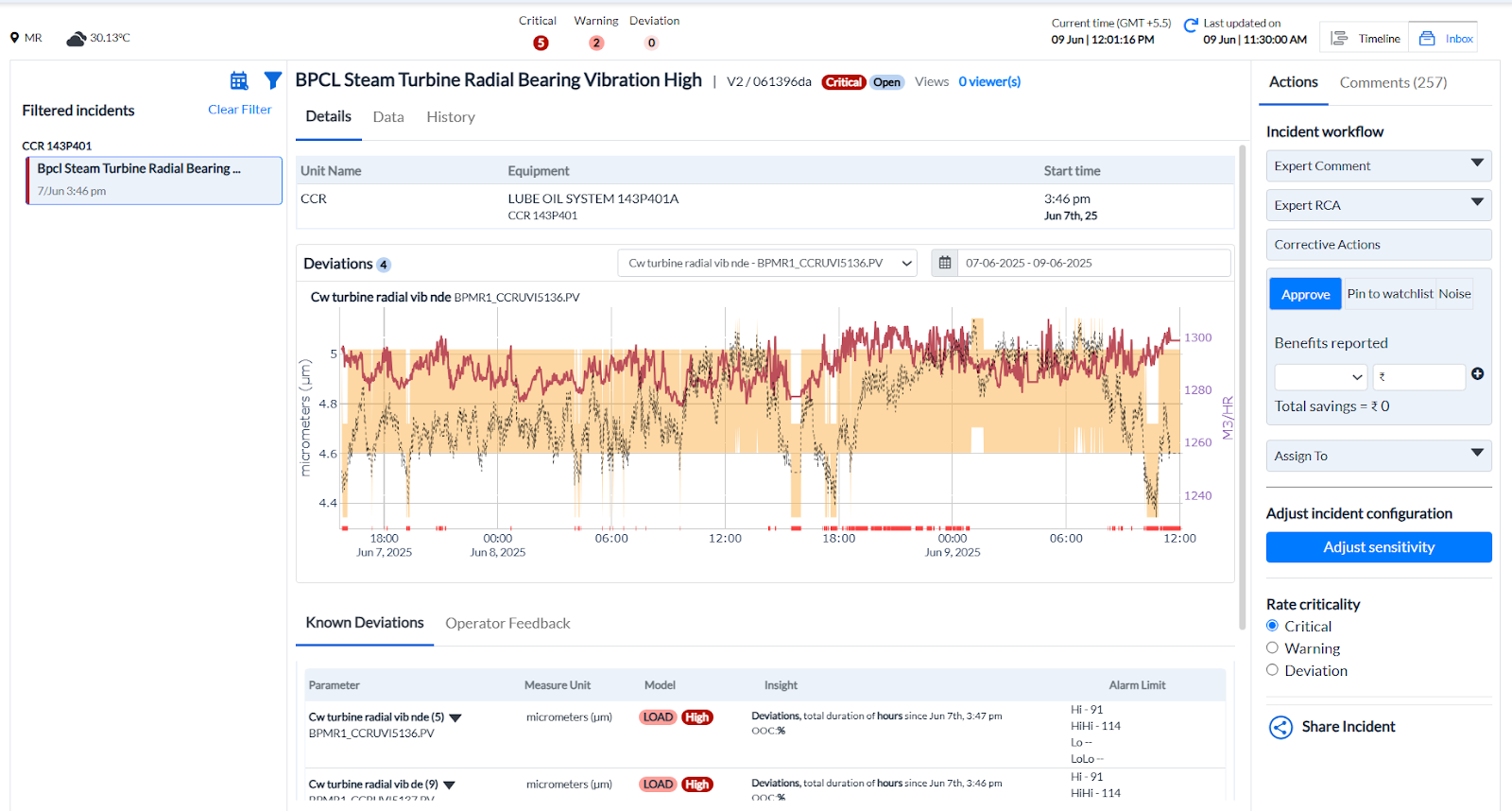
Figure 20. Incidents Page
¶ 1.4 Benefits reported from the Incidents page
Total savings in Rupees can be viewed on the Incidents page. In the top-right corner, under the Actions tab, the Benefits Reported section displays the amount of benefit received. If benefits are received from multiple sources—either due to Pulse features or as a result of Pulse-assisted improvements—the user can click the + button to add each entry. The system will automatically calculate the total savings from all reported sources, and the consolidated amount will be displayed.
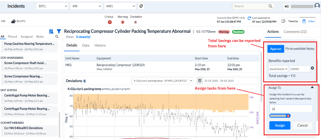
Figure 21. Savings from the Incident page
¶ 1.5 Task Summary (Right Side)
A donut chart provides a snapshot of current task progress:
- Total Tasks: 36
- Completed: 4 (Green segment)
- Not Started: 32 (Gray segment)
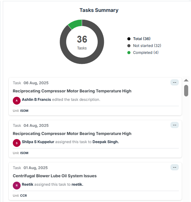
Figure 22. Tasks Summary
This section offers a quick status update on how many tasks are active, completed, or pending action.
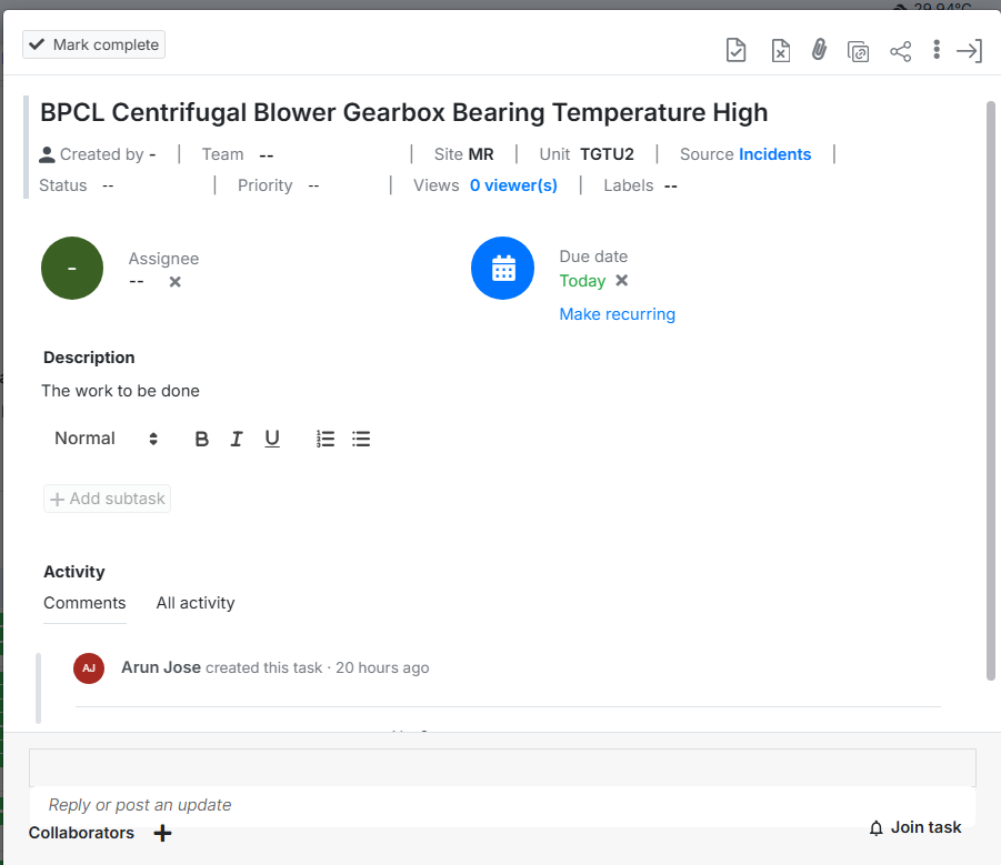
5. Task List (Below Task Summary)
Below the donut chart in the rightmost task section, individual tasks are listed with the following information:
- Task Time: Timestamp when the task was created or updated.
- Title: Name of the Task
- Assignee: The user responsible for completing the task.
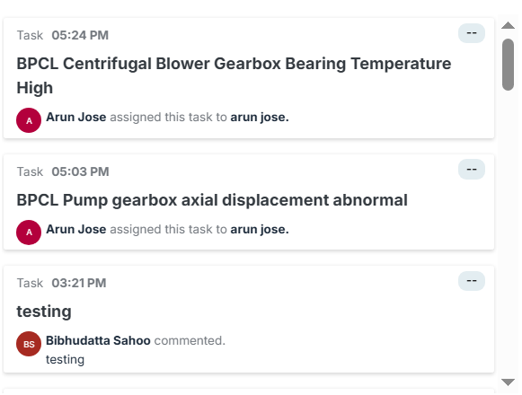
Figure 23. Incident’s names
Clicking on any incident redirects the user to the corresponding Task details page, where they can view information and perform actions related to that specific task, as shown below.