¶ Advanced- Analyze
The Trends tab in the Analyze module is designed to help users visualize and analyze asset-level performance data over time. It offers a flexible and intuitive interface to plot and compare multiple process parameters, such as temperatures, pressures, and currents, with various customization options for deeper insights.
To view the Analysis of Asset Performance
- Log in to Pulse
- Click the Analyze tab from the Advanced module (shown on the left panel).
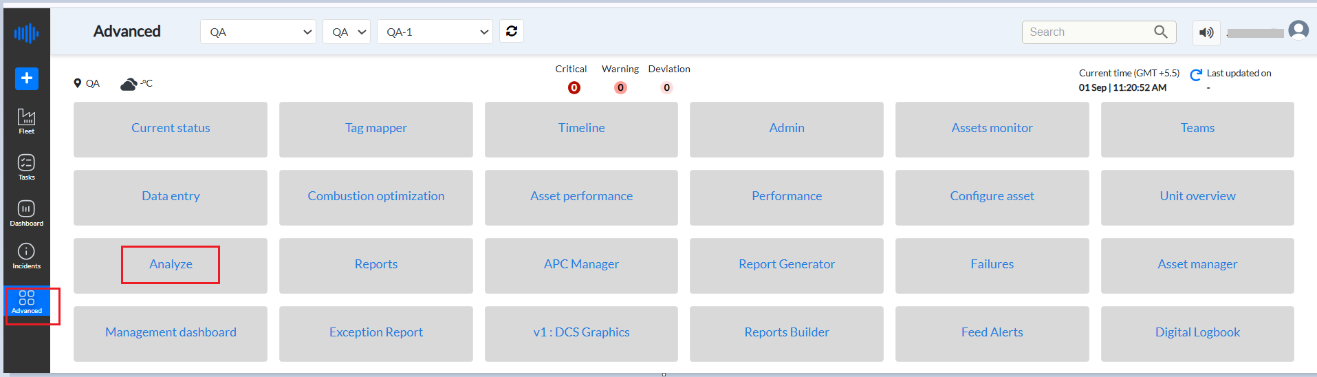
Figure 1. Pulse Advanced - Analyze
3. Select a tag from the Search Tags drop-down list
4. Select the corresponding system checkboxes from the Select Systems panel.
Note: Enter at least three characters to search for a sensor
5. Select an Equipment from the Select Equipment Categories drop-down list.
6. Select corresponding checkboxes to choose a sensor group from the Tag groups drop-down list under each equipment category.
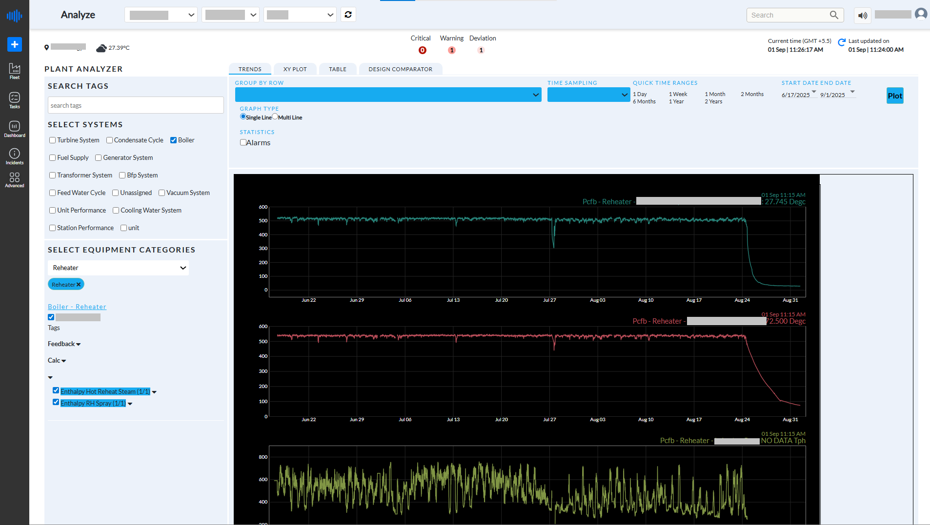
Figure 2. Analyze Page
1. Search Tags
This field allows users to quickly locate specific tags by entering keywords or partial tag names. It helps in filtering out the required parameters from large tag lists.
2. Select Systems
Here, users can choose the system they want to analyze. Once a system is selected, related equipment categories and tags are automatically populated for further selection
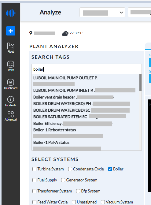
Figure 3. System Selection
3. Select Equipment Categories
This dropdown allows users to narrow down the equipment within the selected system. For example, the category Reheater has been selected, which filters the tags related only to this equipment.
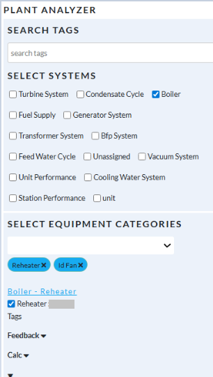
Figure 4. Equipment Category Selector
4. Tag Selection Panel
In this section, users can select the specific parameters (tags) they want to analyze. Tags are grouped by type, such as Metal Temperature, Power Current, etc. Each tag includes a full description for clarity.
- 8 Metal Temperature tags have been selected.
- These tags represent temperature readings from various parts of the motor (bearing and winding) in the NHT RGC 62-K-101B Main Motor.
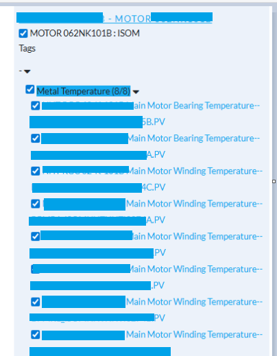
Figure 5. Tag Selection
5. Grouping and Graph Options
- Group By Row: This option arranges each selected tag in a separate row for easier comparison.
- Graph Type: User can choose between Single Line and Multi Line views.
- Statistics - Alarms: User can enable this to overlay alarm limits if configured for the tags (currently disabled in the below screenshot).
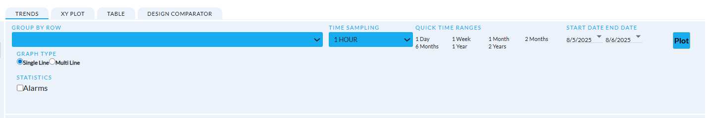
Figure 6. Trends Tab on Analyze page
6. Time Configuration
- Time Sampling: This determines the data granularity on the graph. In the current view, data is sampled hourly (1 Hour).
- Quick Time Ranges: Predefined options like 1 Day, 1 Week, 1 Month, etc., allow fast switching between date ranges.
- Start Date - End Date: Custom date range selection is available to focus on specific analysis windows. The current range is from 5th August 2025 to 6th August 2025.
After selecting tags and setting the date range, clicking the Plot button generates the trend graphs.
¶ 10.1 Trend Graphs
The Trends view is the core visualization area of the Plant Analyzer, where users can explore time-series trend graphs for the selected tags.
Each graph displays the progression of a specific parameter over time, with:
- The x-axis shows the timeline (based on selected sampling frequency, such as hourly),
- The y-axis represents the corresponding tag values (e.g., temperature in °C),
- And a label indicating the tag name along with its most recent value (e.g., Main Motor Winding Temperature: 38.639°C).
Color-coded trend lines make it easy to distinguish between different tags, helping users identify any deviations, patterns, or anomalies at a glance. The number of graphs shown corresponds to the number of tags selected—for example, selecting 8 tags will generate 8 individual graphs.
To View Trends
- Click the Trends tab
- Select a value from the Group By Row drop-down list. The available values are: Equipment, Component, Subcomponent
- Select a value from the Time Sampling drop-down list. The available values are: Default, 1 min, 15 mins, 30 mins, 1 hour, 1 day
- Select an option button for Graph Type: Single Line or Multi Line
- Select or clear the Alarms checkbox to include or exclude alarm values from the graph.
- Click a value from the Quick Time Ranges panel to view the graph for that time range.
- Click the down arrow along each date to select the date range - Start Date and End Date.
- Click Plot to display the Trends graph for the selected values
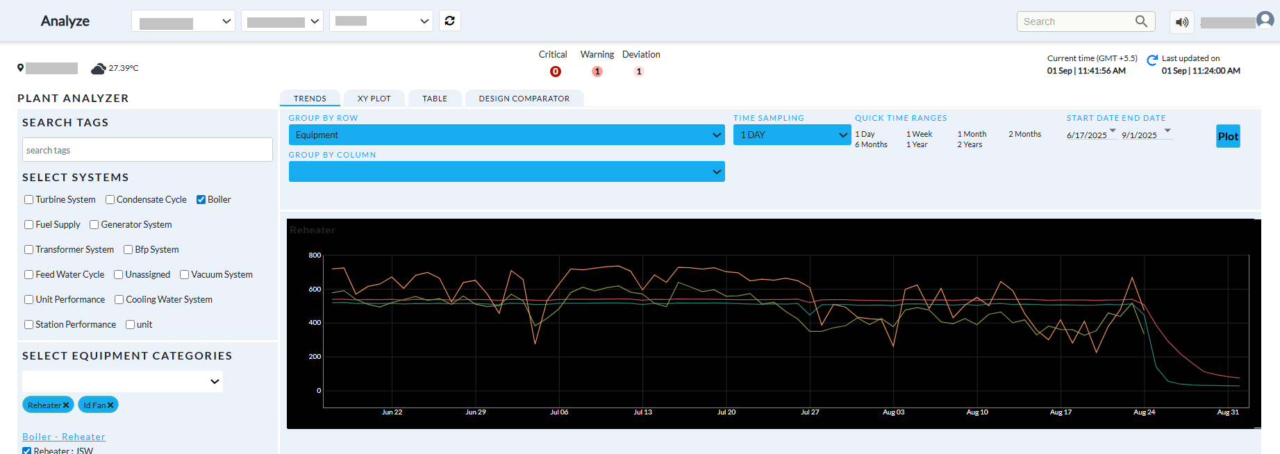
Figure 7. Multi-Line Plot
Users can:
- Choose between Single Line or Multi Line graph formats,
- View data for periods ranging from a single day to over a year in just a few seconds,
- Zoom, pan, and interact with the graphs for detailed analysis,
- Customize the appearance by adjusting line colors and time sampling intervals.
This view is ideal for:
- Monitoring equipment performance trends over time,
- Comparing similar parameters from different sensors or locations,
- Diagnosing operational issues and proactively spotting anomalies.
Overall, the Trends tab offers a powerful and flexible interface for deep asset performance visualization and decision support.
The areas a user can focus on include identifying any trends that may be developing, such as equipment degradation or deterioration of plant performance, and take corrective action before the issue becomes a significant problem. Identifying relationship between two tags against each other to identify any correlations between them that may indicate a potential issue or provide insight into optimizing the plant's performance.
Compare the current performance of the plant to its original design specifications to identify any deviations from the design specifications and take corrective action to optimize plant performance.
Analysis of Plant Performance- Trends Graph
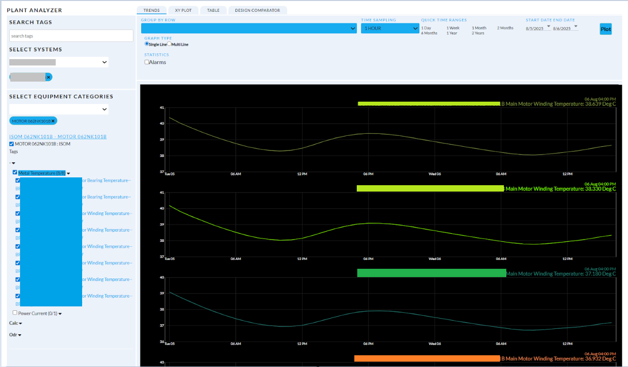
Figure 8. Single - line graph
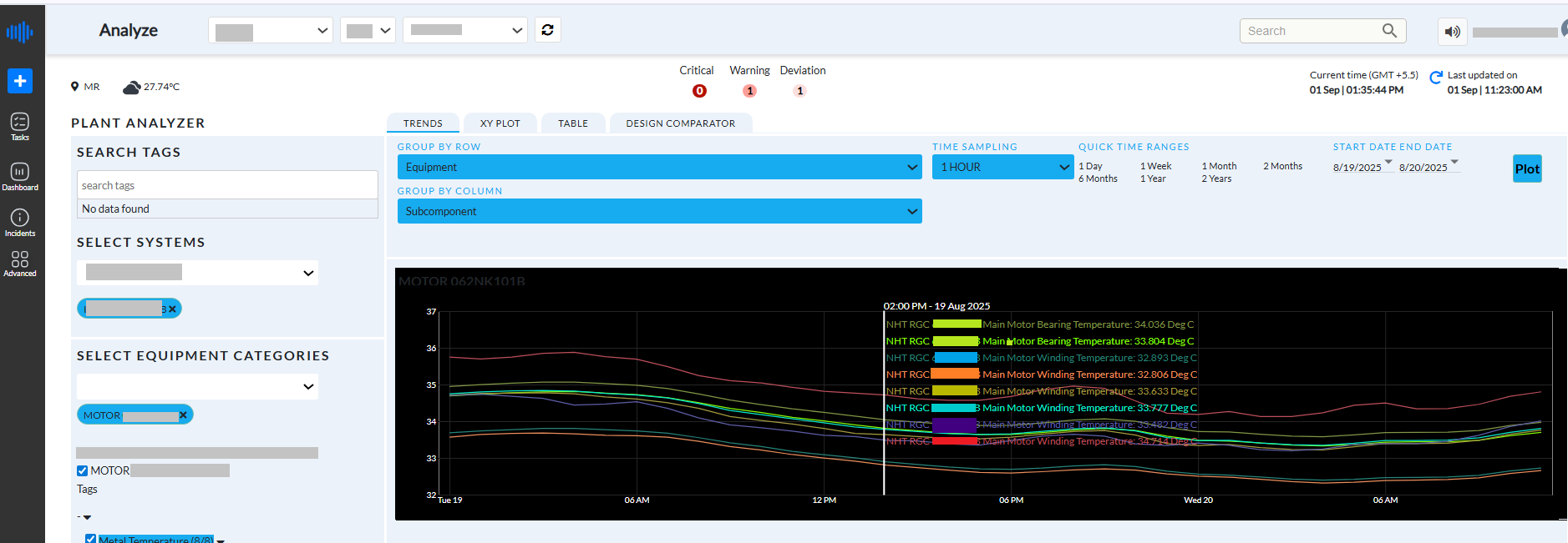
Figure 9.Multi-Line graph
Graph Visualization and Tag Interaction
The plotted graph displays the trend of multiple selected tags over time, with each tag represented by a uniquely colored line. This color distinction helps users visually separate and interpret each parameter without confusion.
In this example, 8 Metal Temperature tags related to motor winding and bearing temperatures are selected. Each line on the graph corresponds to one tag and is labeled with the tag name and the latest recorded value (e.g., Main Motor Winding Temperature: 39.338°C).
Interactive Features:
- Hover for Details: Users can move the mouse cursor over any colored line in the graph. As they hover, the interface displays detailed information about that specific tag at the selected timestamp. This includes the tag name and its exact value, making it easier to track changes or anomalies at specific times.
- Legends: On the top-right corner of the graph, a legend displays all selected tags along with their latest values and corresponding line colors. This helps in quickly identifying which line represents which tag.
- Smooth Navigation: Users can zoom in, zoom out, and pan across the graph timeline to explore data across different hours or days based on the configured time range.
This interactive capability is especially useful for:
- Investigating unusual spikes or drops,
- Comparing sensor behavior under similar operating conditions,
- Analyzing historical behavior for troubleshooting or optimization purposes.
Overall, this feature enhances the user experience by combining data clarity with intuitive interaction, enabling precise equipment monitoring and effective decision-making.
Scatter Plot: Helps compare any two parameters and the change in their relationship over a period of time. The user can choose to view comparisons of these parameters over successive days or weeks, or months
¶ 10.2 XY Plot
The XY Plot tab is designed to help users analyze the relationship between two selected parameters over time. It provides a visual representation of how two variables interact with each other, using scatter plots that reveal patterns, correlations, and deviations in asset behavior.
Configuration Options
- X Axis: Allows the user to choose a process tag to be plotted on the horizontal axis (e.g., Main Motor Bearing Temperature).
- Y Axis: Allows selection of a second process tag for the vertical axis (e.g., Main Motor Winding Temperature).
- Compare: Enables comparison of data across fixed time intervals such as Daily, Weekly, Monthly, etc. Each plot represents the same variable pair but for a different time period.
- Time Sampling: Determines the data resolution (e.g., 1 Hour) and controls how frequently data points appear on the plot.
- End Date: Specifies the last date for the comparison range. The system generates time-sliced plots based on this date and the selected interval.
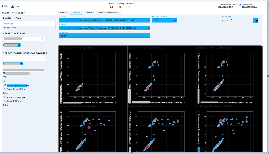
Figure 10. XY Plot
Visualization Area
The XY Plot generates multiple scatter plots, each corresponding to a defined comparison interval (e.g., each panel represents one month).
Each data point represents a recorded pair of X and Y values at a specific time. The distribution and clustering of points help users interpret trends and correlations between the selected parameters.
Key markers:
- Red Circles often represent the most recent (or the latest) values for the dataset within that time frame.
Key Use Cases
- Detect Correlations: Understand the strength and direction of relationships between two parameters (e.g., bearing vs. winding temperature).
- Monitor Operational Patterns: Identify consistent operating zones or shifts across time.
- Spot Anomalies: Easily detect outlier points that may signal faults, inefficiencies, or unexpected events.
- Compare Historical Behavior: Evaluate how the parameter relationship evolves across months, operational cycles, or process changes.
Interactivity
Users can interact with each plot to:
- Analyze how operating conditions shift over time,
- Adjust tag selections, time intervals, and sampling rates for more focused analysis.
The XY Plot feature supports deeper diagnostics by enabling visual correlation analysis, making it a critical tool for process engineers, reliability analysts, and operational decision-makers.
10.3 Table View
Tabular: Sensor Values are displayed under 'TAG DATA'. The statistics min, max, median and standard deviation based on each load bucket is displayed under 'STATISTICS'
To view real-time data of systems:
- Click the Table tab to view the real-time data of various plant systems in a tabular format.
- Select a value from the Aggregate drop-down list. The available values are: Avg, Min, Max.
- Select a value from the Window drop-down list. The available values are: Hourly and Daily.
- Click the down arrow along each date to select the date range - Start Date and End Date.
- Click View Table to display the table for the selected values.
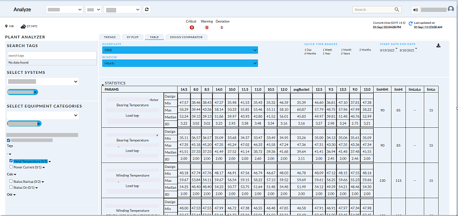
Figure 11. Table Tab
- Click the download button to download the table.
¶ 10.4 Comparing Current Performance with Original Design Specifications
To view the comparison with the design:
- Click the Design Comparator tab
- Select a value from the X Axis drop-down list.
- Select a value from the Y Axis drop-down list.
- Select a value from the Compare drop-down list. The available values are: None, Daily, Weekly, and Monthly.
- Select a value from the Time Sampling drop-down list. The available values are: Default, 1 min, 15 mins, 30 mins, 1 hour, 1 day
- Click the down arrow along the date to select the End Date.
- Click Add Design Value to add a previously designed value.
The Design Settings page appears
- Click Add new and select a value from the spin boxes to add a new value for the design.
- Click Apply to apply the selected design.
- Click Plot to display the comparative graph for the selected values.
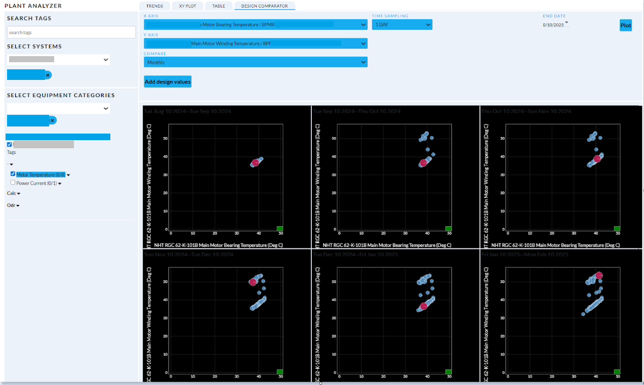
Figure 12. Design Comparator tab
- Green block is the design values. Here we have given 1 design value represented in green block at 50.